
SiaaSoo
Brand Strategy
Logo Design
VI Design
IP Image Design
Industrial Design
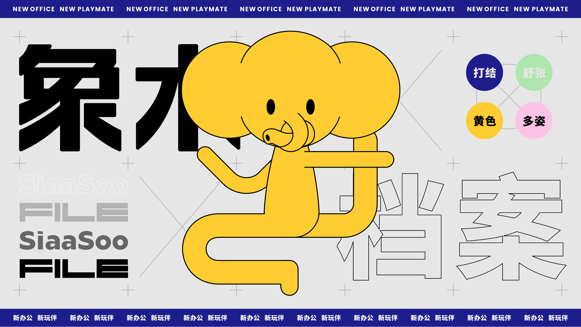
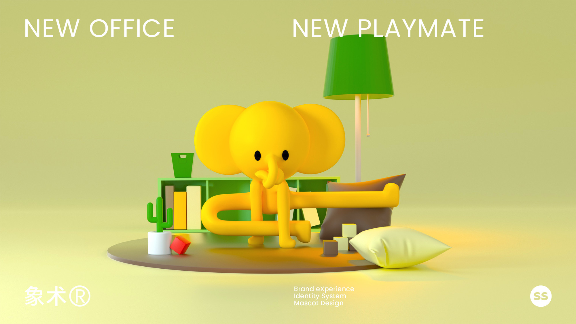
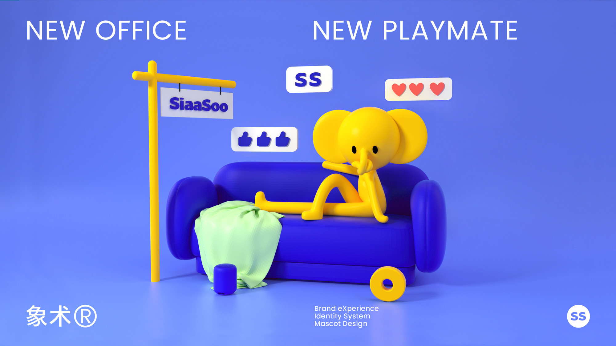
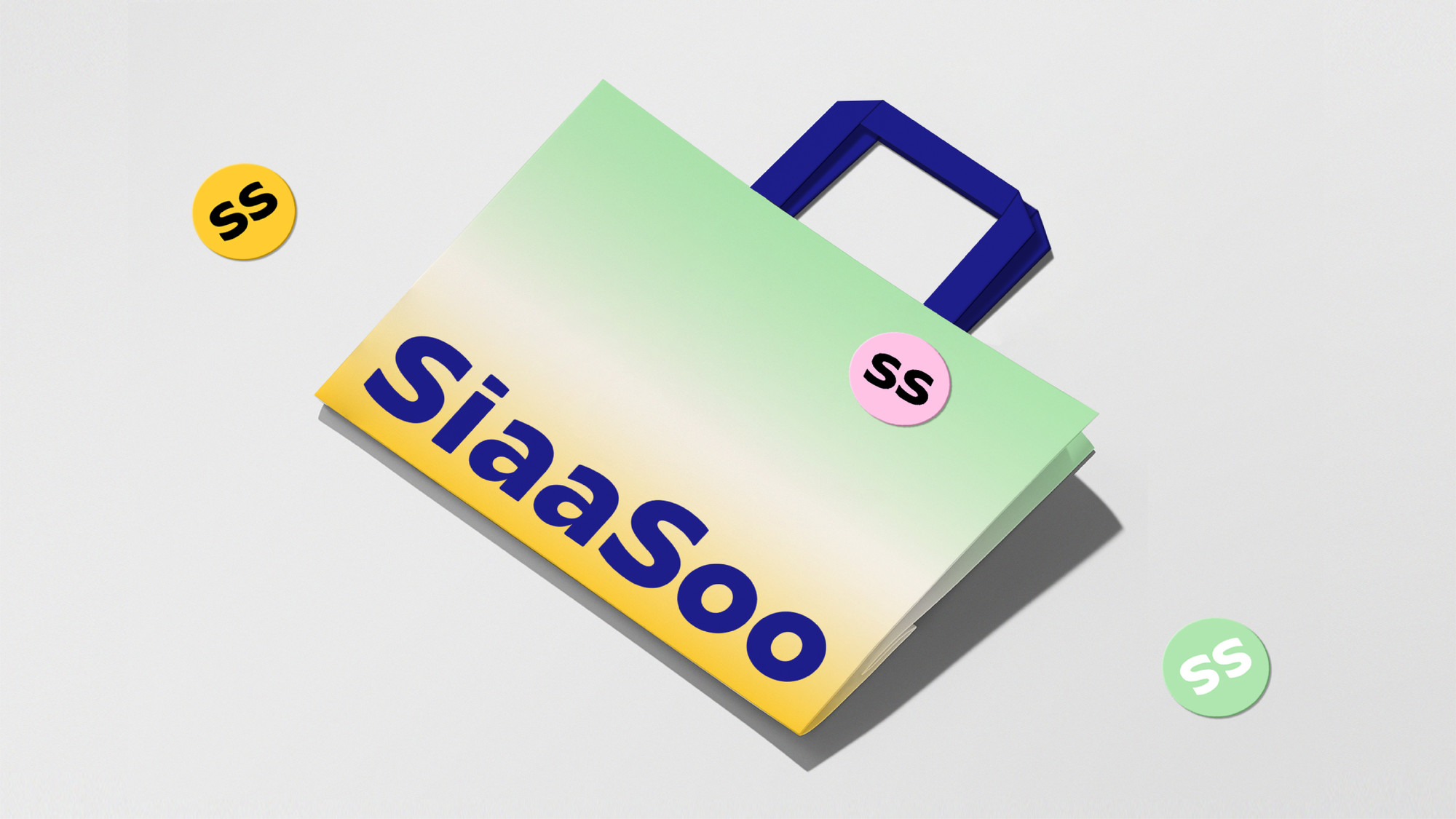
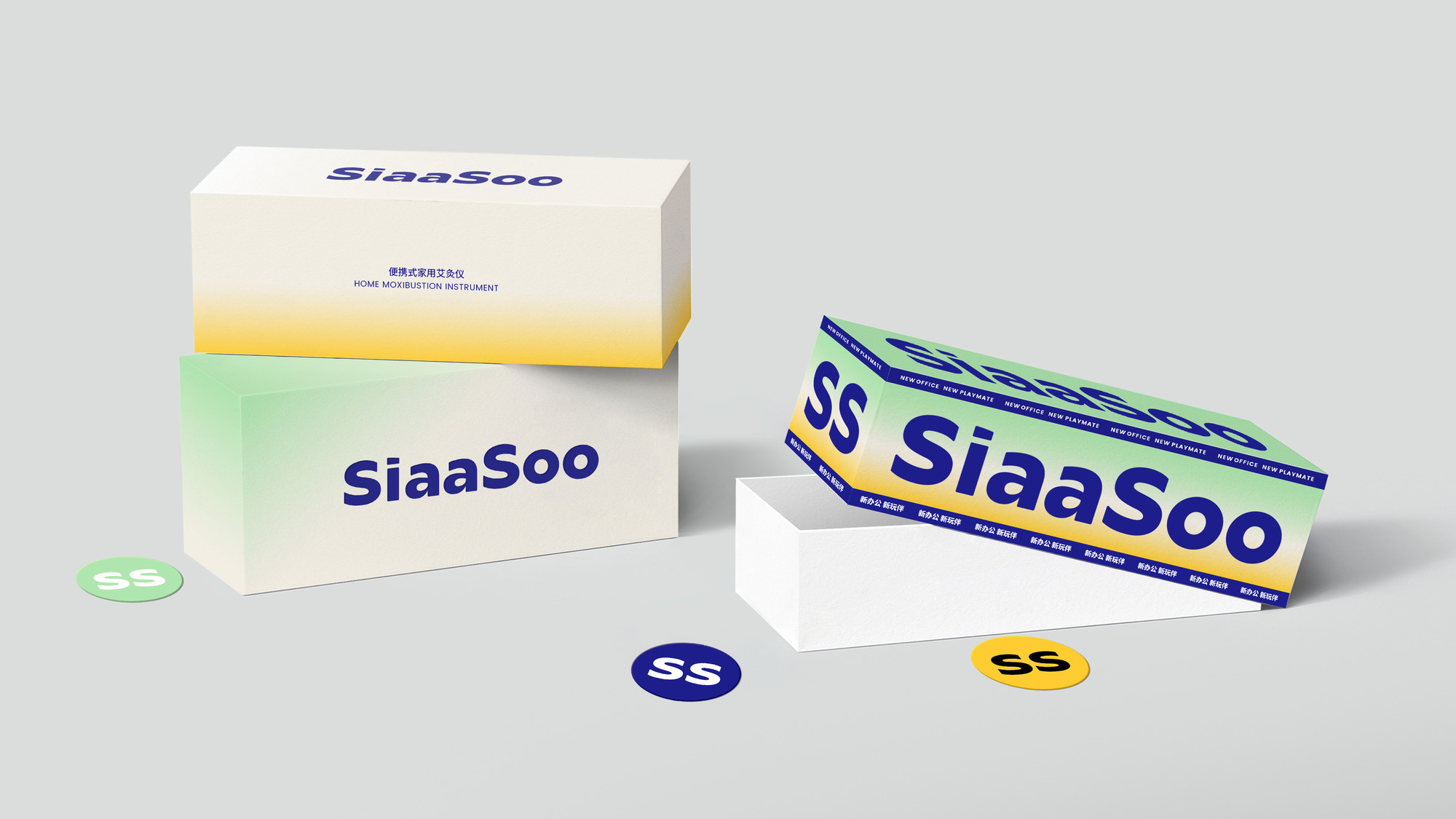
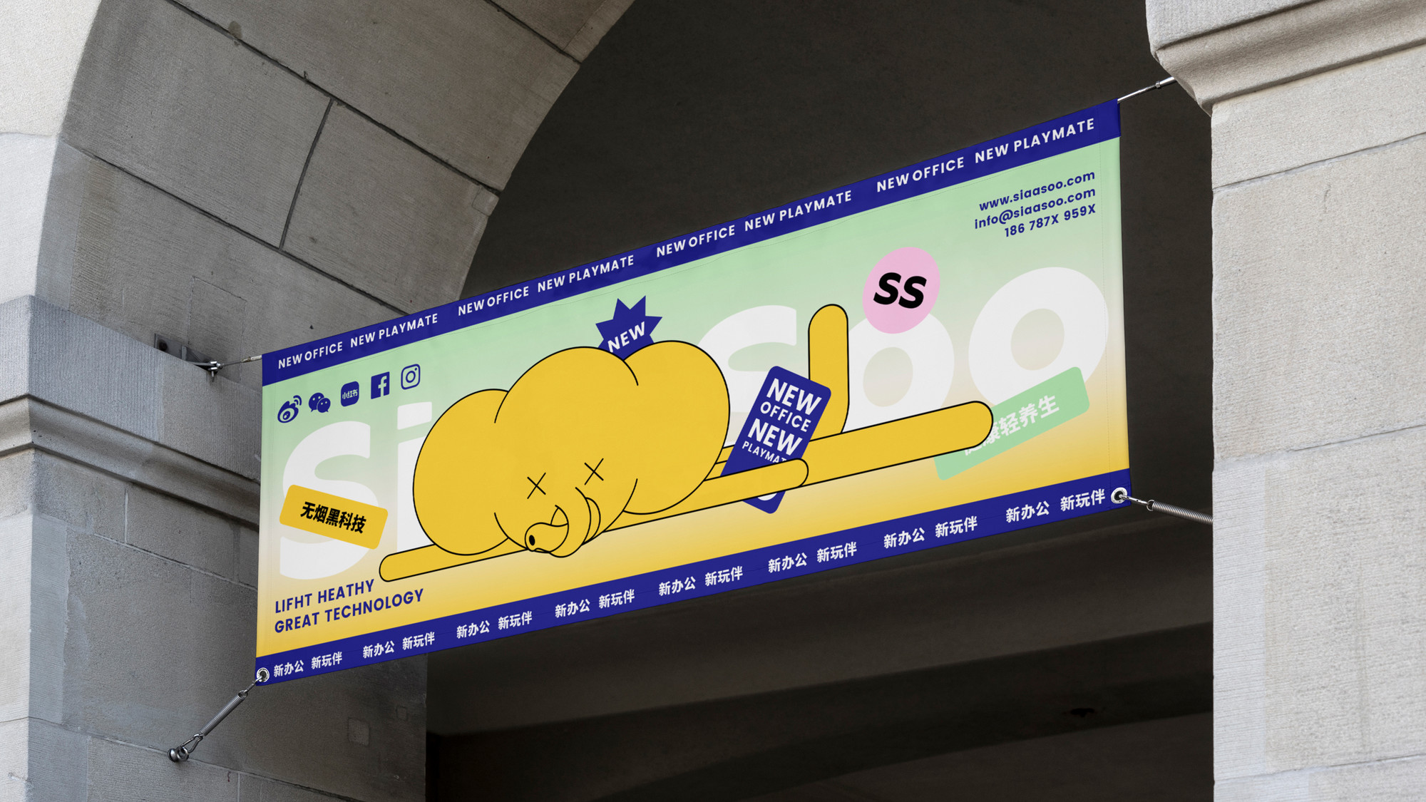
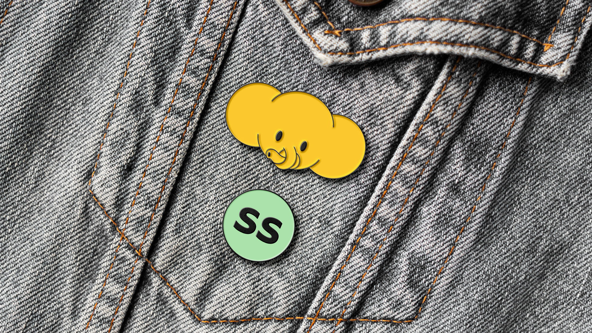
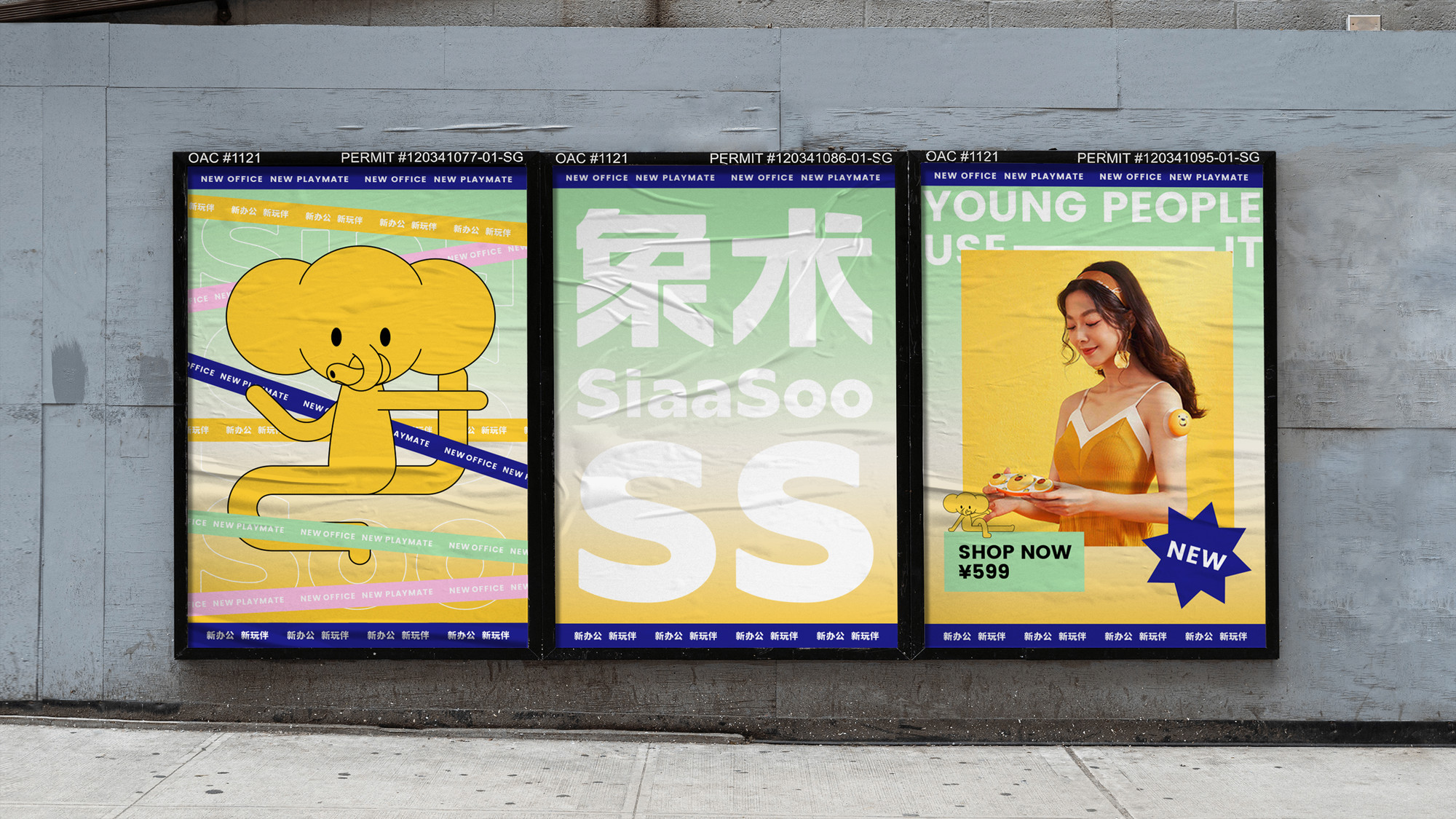
SiaaSoo is a trendy brand specializing in electronic massage products, and they require a new identity to convey their brand essence.
First and foremost, we aim to help the brand create a fashionable impression, which aligns with the brand's goal of standing out in this traditional industry and serving the younger generation. The messages conveyed by colors transcend borders, which is why we have chosen green and yellow as the focal point of the brand's visual identity. Green represents health, while yellow symbolizes warmth, with a gradient design that strikes a balance between evoking a youthful atmosphere.
The font logo is casual and childlike, emphasizing the rhythm of the lettering and giving people a relaxed atmosphere.
In the Chinese context, "Xiangshu" includes the meaning of elephant, so we boldly created an "uncomfortable elephant" because its trunk and limbs are knotted, which is a manifestation of physical ailments and also reflects the value of massage products; at the same time, it is also interesting, and the exaggerated expression allows the brand to show amazing appeal.


Add
B5-535, Fantasia Fortune Plaza No.3 Shihua Road,
Futian bonded area, Futian Dist., Shenzhen
Business
info@zwave.com
© 2020-2024 Z WAVE DESIGN. All rights reserved.