


LITTLE PUMKIN
Space Design
LITTLE PUMKIN specializes in the small appliance industry, becoming a symbol of refined retro living culture with its high-quality, playful, and vintage-inspired products. With a deep understanding of design aesthetics and artistic creativity, the brand has quickly risen as a dark horse in the industry.
The brand's refined retro style and playful creativity have also gained immense popularity among China's Generation Z consumers.
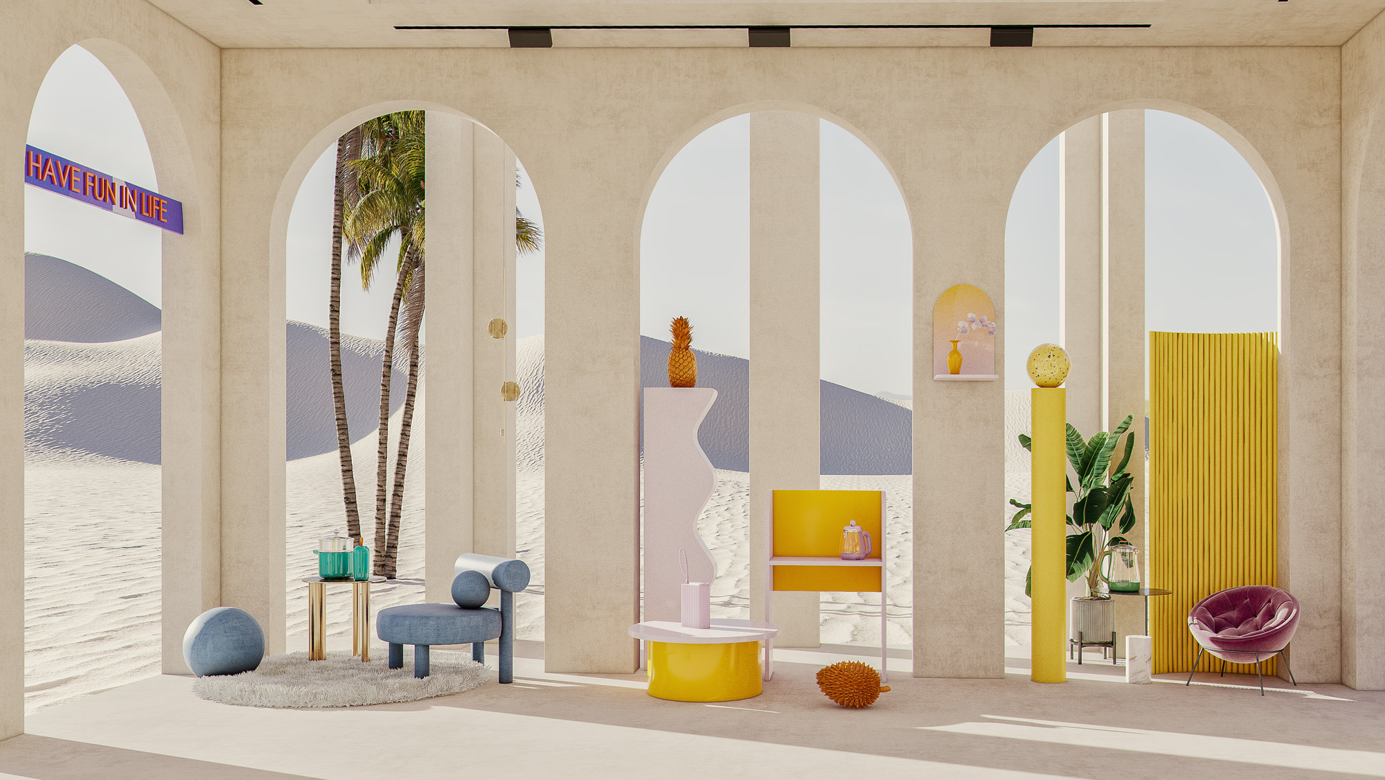
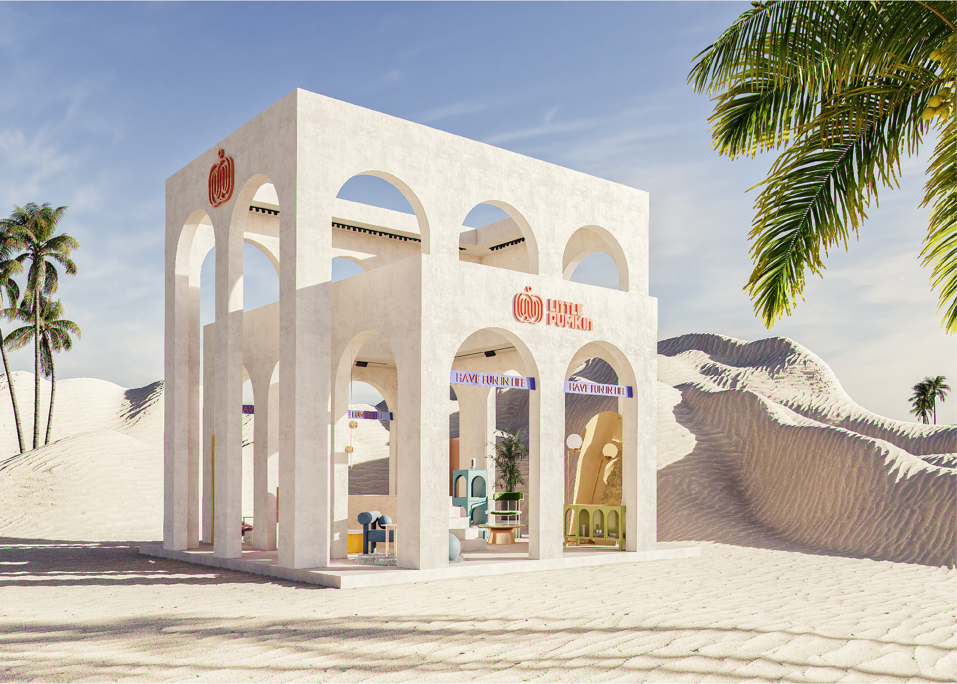
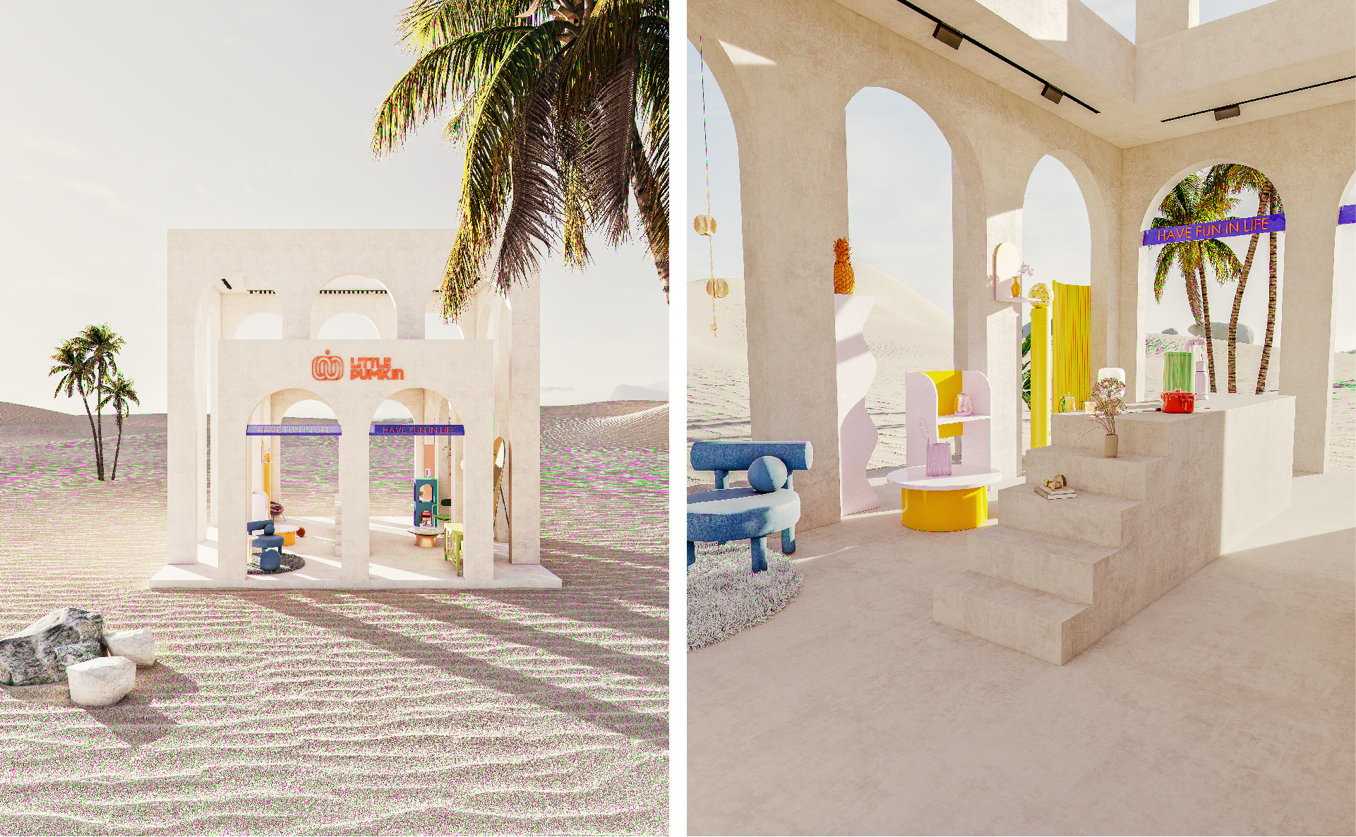
Through an in-depth analysis of the brand, LITTLE PUMKIN's logo represents the interaction, opposition, unity, and intersection between people, showcasing the brand’s open, inclusive, creative, and passionate culture. By integrating Western classical architectural aesthetics and deconstructing and reconstructing elements, we have elevated LITTLE PUMKIN’s brand tone and philosophy.
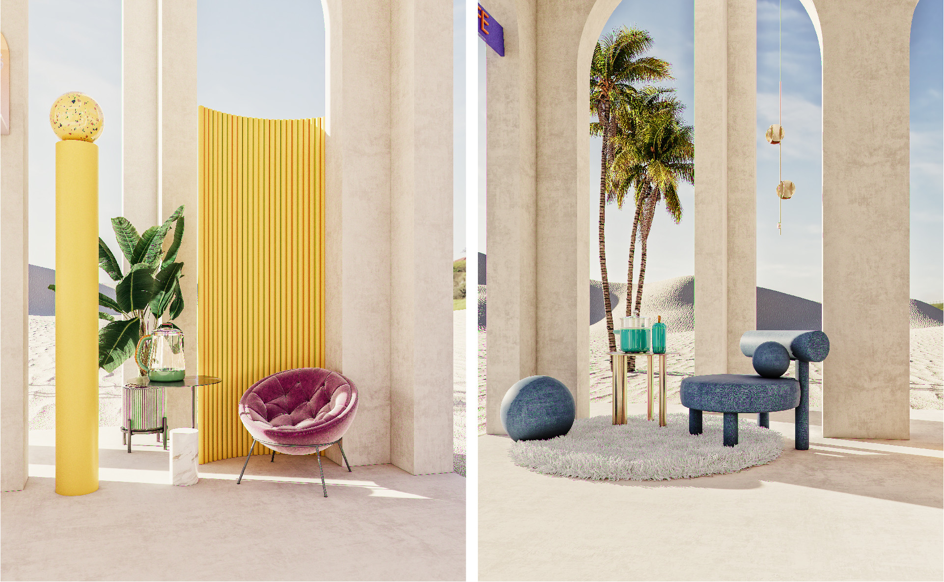
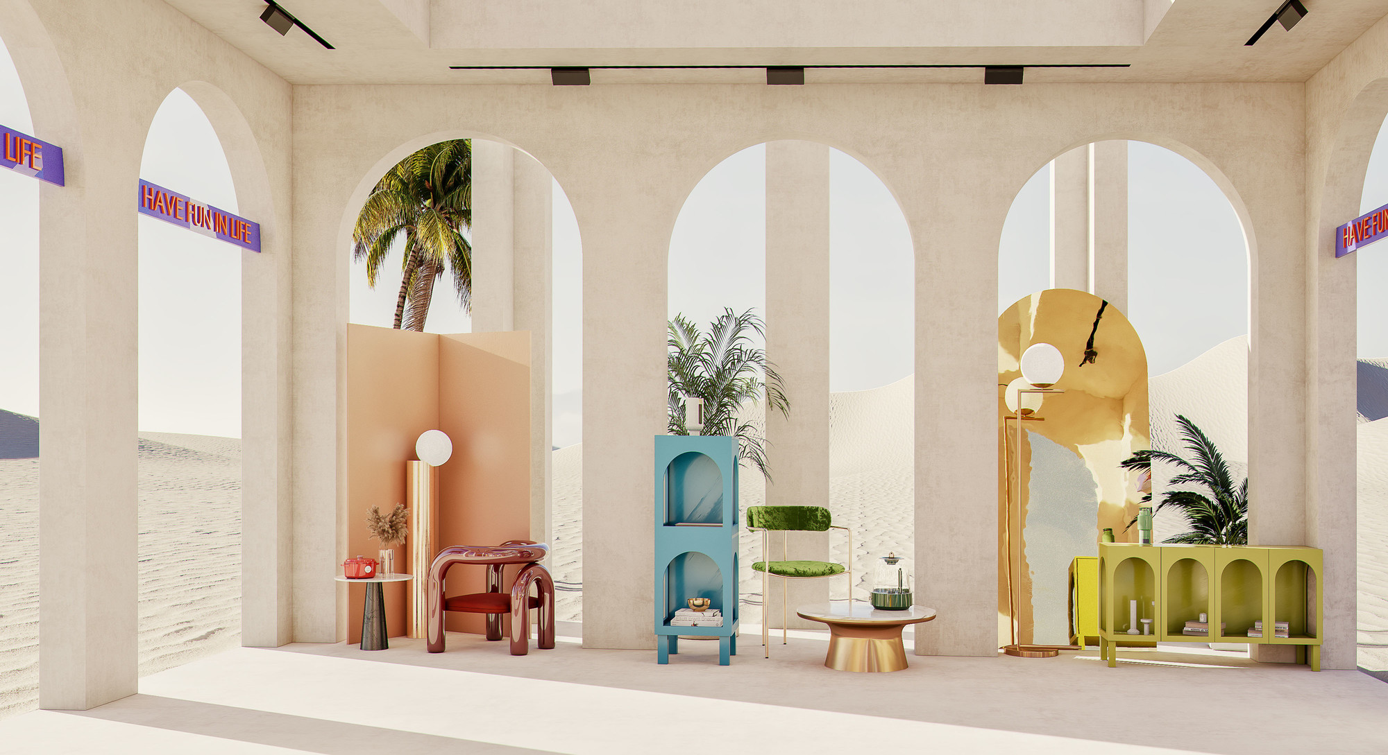
The exhibition booth design conveys this philosophy through a cross-over of top-bottom and left-right arrangements, using the "arch" element inspired by ancient Roman architecture as a foundation. The arch element, renowned for its perfect balance between basic form and geometric aesthetics, creates a design that establishes connections, regardless of the viewpoint.


Address
B5-535, Fantasia Fortune Plaza
No.3 Shihua Road,
Futian bonded area, Futian Dist., Shenzhen
© 2020-2026 Z WAVE DESIGN. All rights reserved.