


JisuLife
Logo Design
VI Design
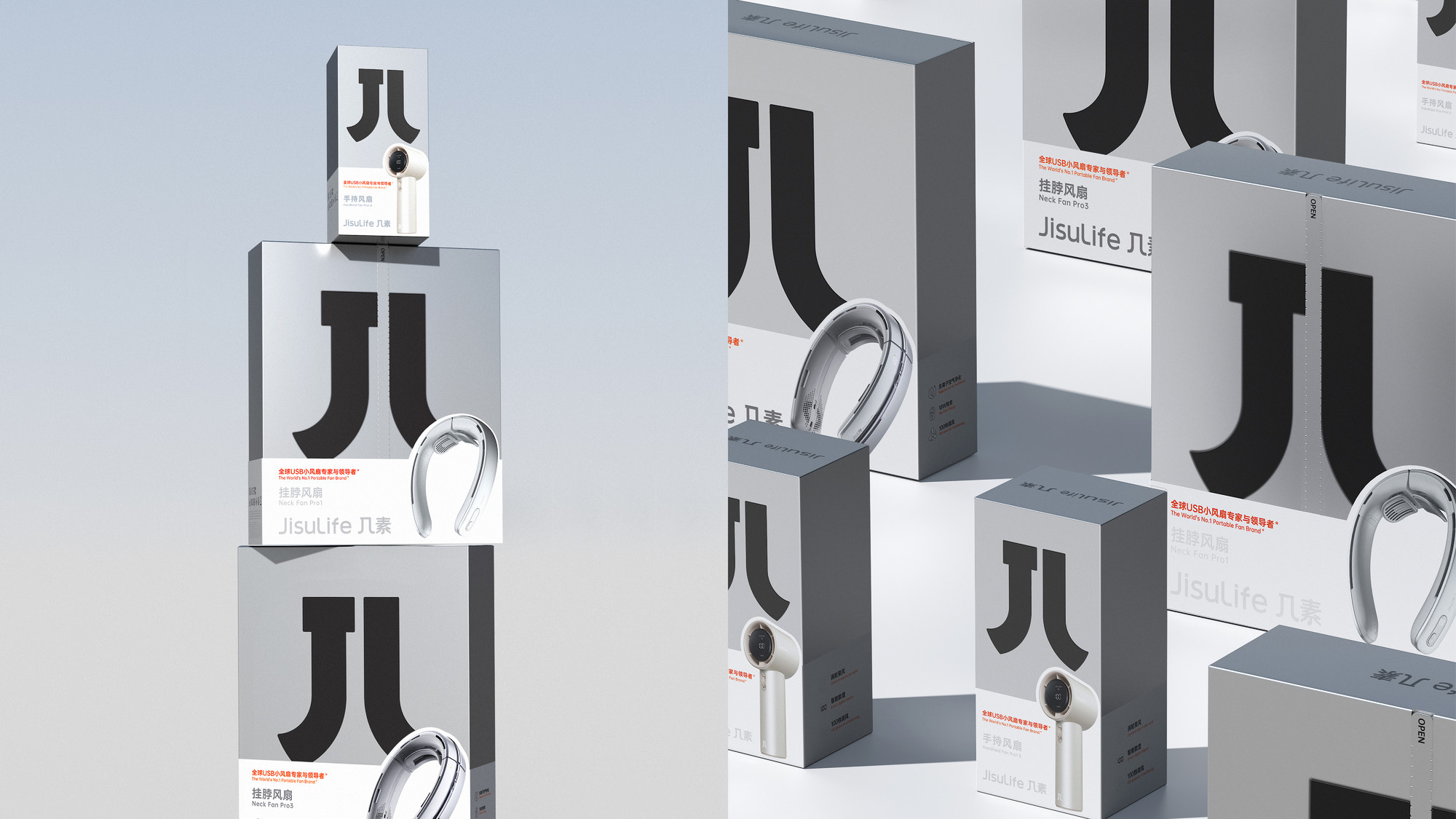
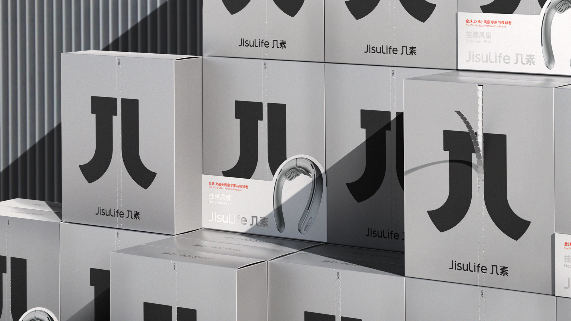
Systematic Packaging Design
Product Design
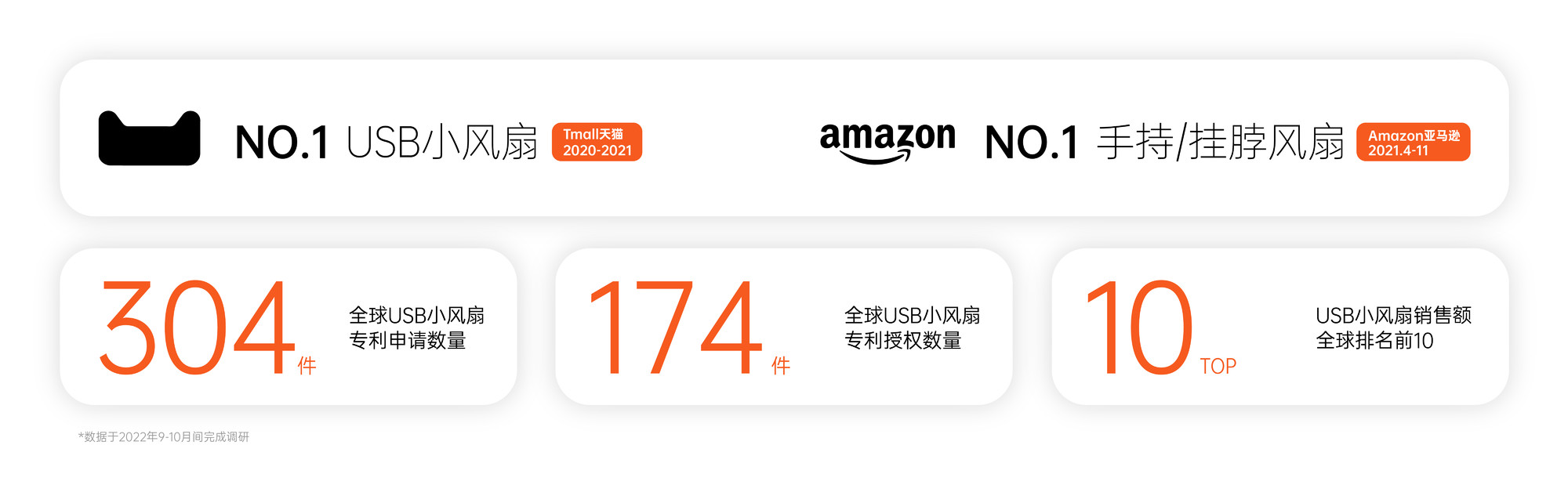
JisuLife is a global leader in the USB fan industry, with an extensive presence in over 40 countries and regions. The brand and its products have earned a stellar reputation worldwide. For two consecutive years (2020-2021), JisuLife ranked first in USB fan sales in the Tmall platform category. From April to November 2021, the brand also dominated the USB fan subcategory (handheld and neck fans) on Amazon, securing the top sales position. With a global ranking in the top 10 for USB fan sales, JisuLife has filed 304 patent applications and holds 174 authorized patents globally.
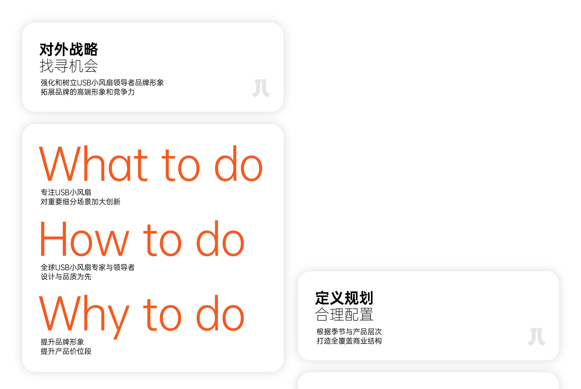
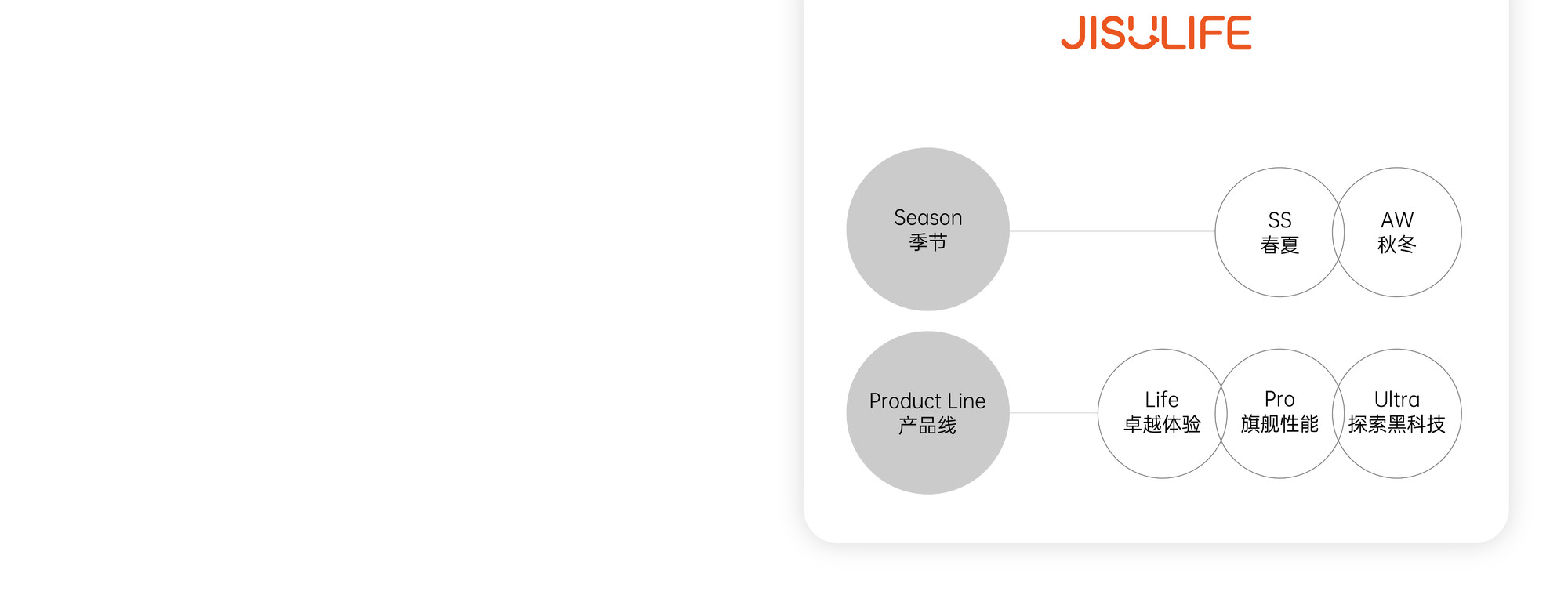
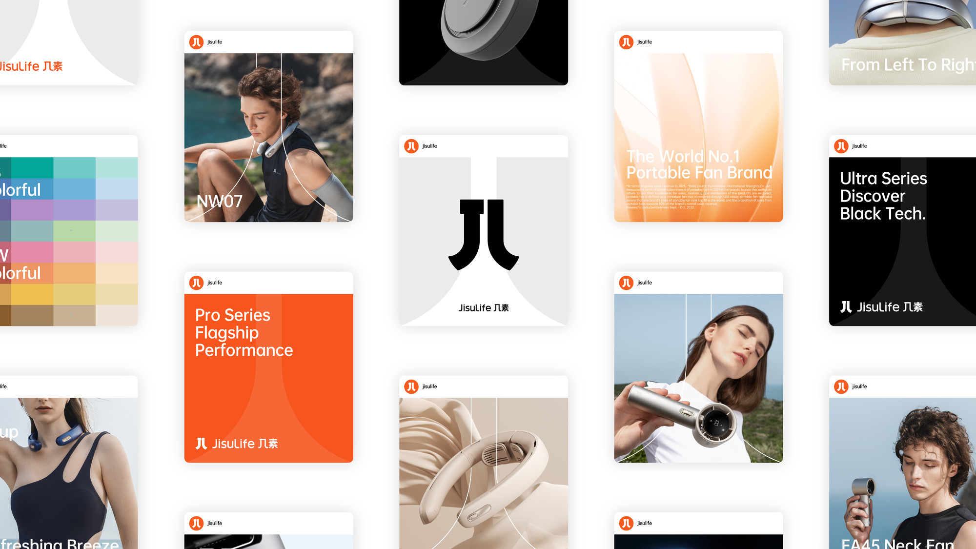
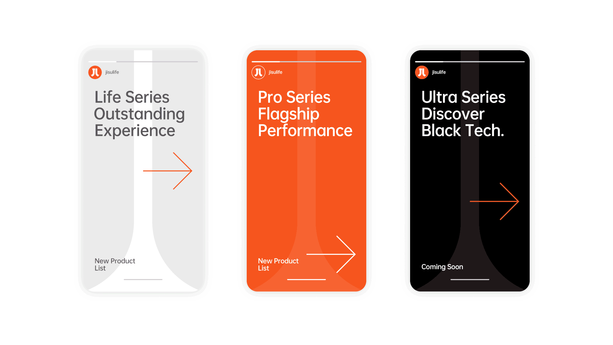
In 2022, JisuLife redefined its brand strategy, introducing the "SS Spring-Summer" and "AW Autumn-Winter" lines, alongside the "Life," "Pro," and "Ultra" product lines, each tailored for specific usage scenarios. This expansion called for a more systematic visual identity, designed to support future business strategies and maintain its competitive edge in both domestic and international markets.
Awards
IDEA International Design Excellence Award
GDA German Design Award - Winner
Selected for APD Asia Pacific Design Yearbook
Selected for Creative Presentation 9 Yearbook
Golden Reed Design Award - Nominee
China Star Design Award - Excellence Award
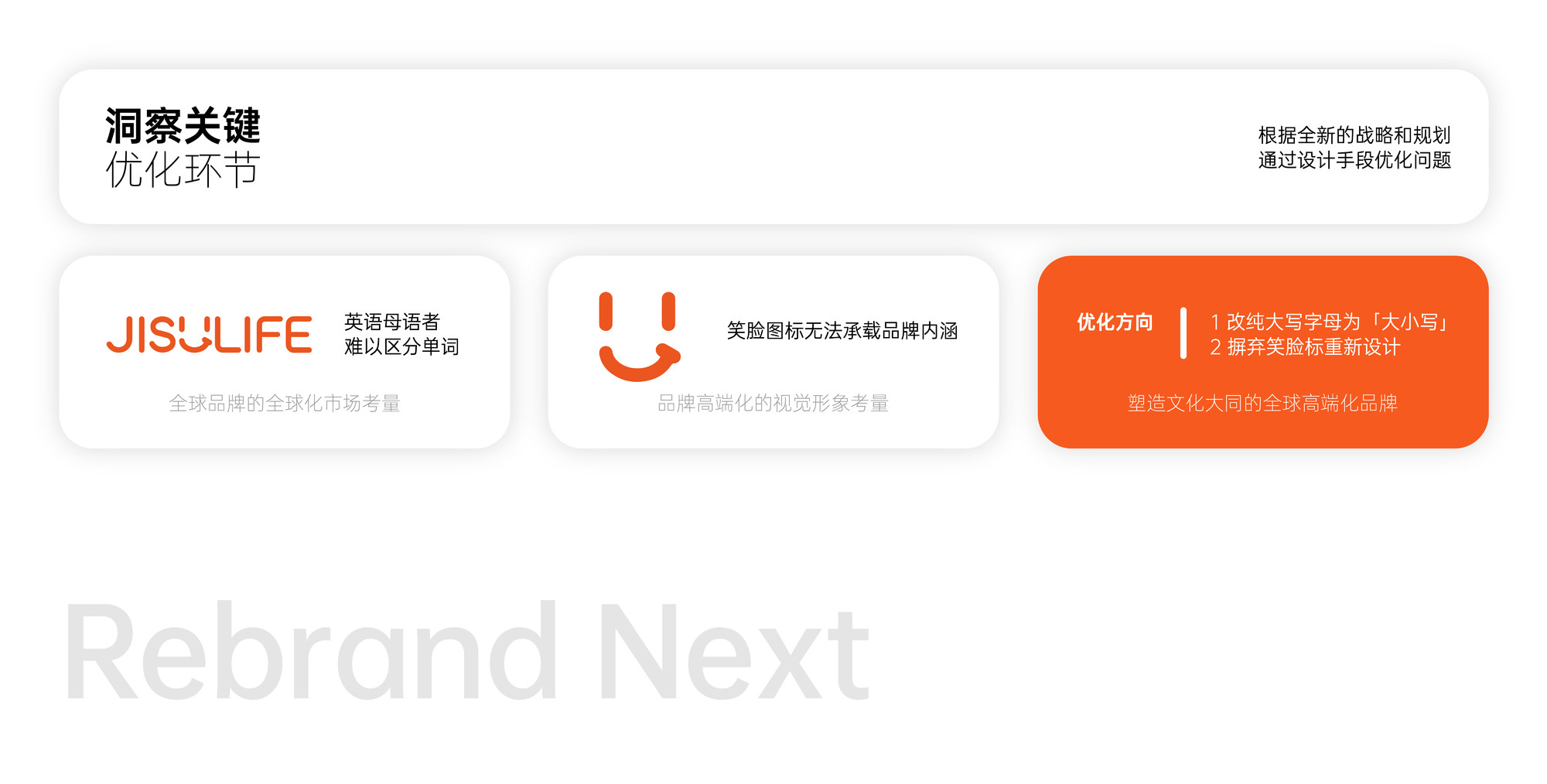


JisuLife's original visual identity was based on a stylized English smiley face, representing a comfortable and approachable brand image. However, this also created a childish and cheap brand impression, which was inconsistent with JisuLife's leading position and new brand planning. Taking a global perspective, we proposed the brand concept of "cultural harmony," combining the letters "J" and "L" to form the abstract Chinese character "几" (ji), which became the brand's visual signature. This created a symbol that people from both Chinese and English cultural backgrounds could understand, transforming the simple text into a meaningful expression and building a brand that resonates across global cultural contexts.
Regarding the typography, we abandoned the flashy elements of the original font, emphasizing practicality and efficiency. We changed the all-caps English letters to capitalize the first letter of each word, further distinguishing "Jisu" from "Life," reducing reading barriers for overseas consumers and enhancing the brand's readability. The Chinese characters followed the same approach, with the addition of the horizontal bar "J" to the character "几," maintaining readability while creating overall consistency.
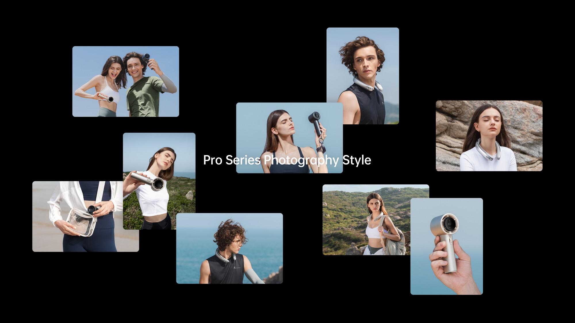
We collaborated with the JisuLife team to develop a new photographic style for our high-end series.
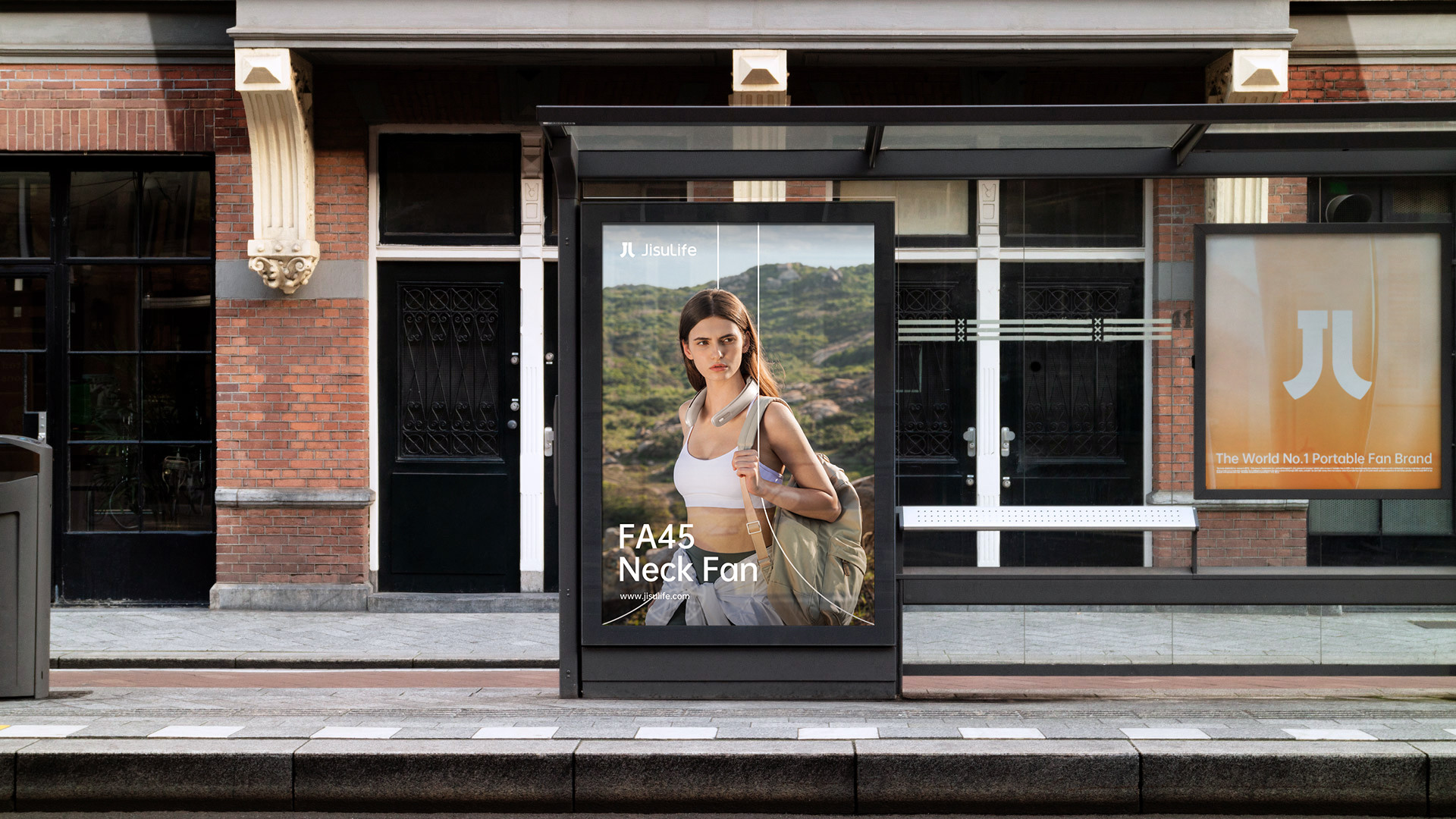
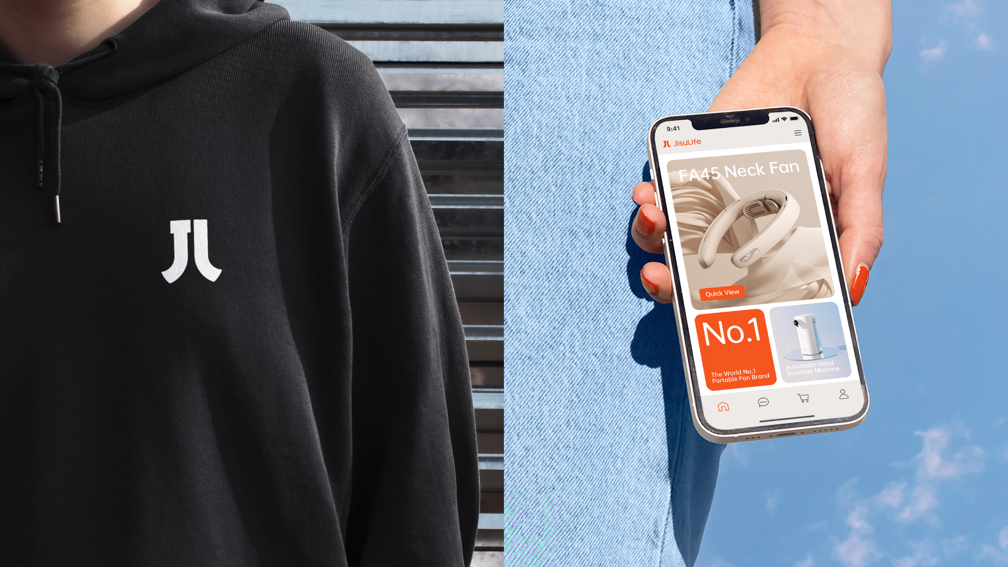
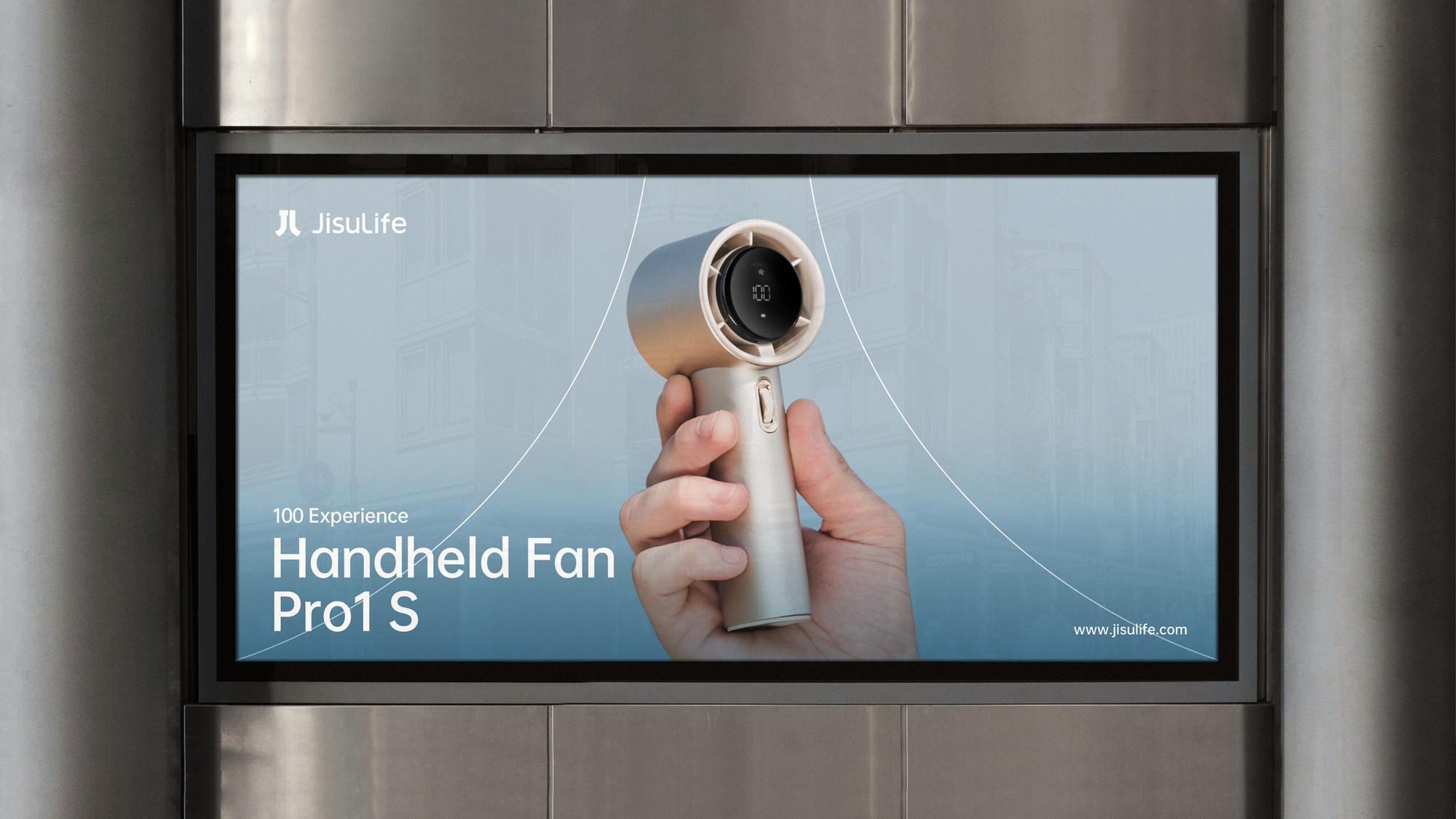
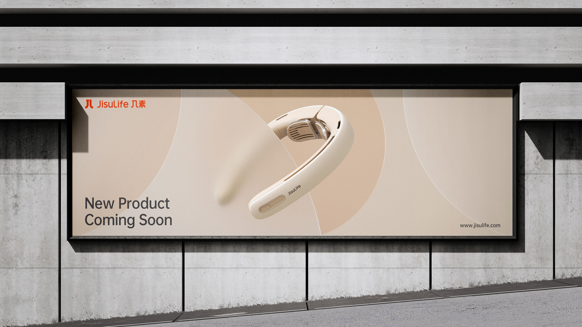
By expanding on the symbols, we created a set of symmetrical "几" (ji) shaped auxiliary graphics. These graphics further reinforce the brand's value, and their flexible use better complements the brand image and products. Applicable to different sizes and scenarios, they form a unified visual language, establishing a more global and inclusive brand image for JisuLife.


Address
B5-535, Fantasia Fortune Plaza
No.3 Shihua Road,
Futian bonded area, Futian Dist., Shenzhen
© 2020-2026 Z WAVE DESIGN. All rights reserved.