
Falata
Brand Strategy
Logo Design
VI Design
Industrial Design
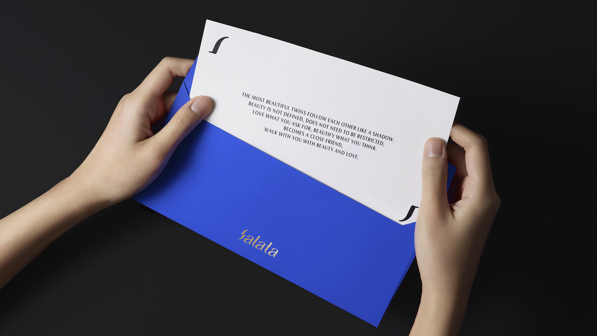
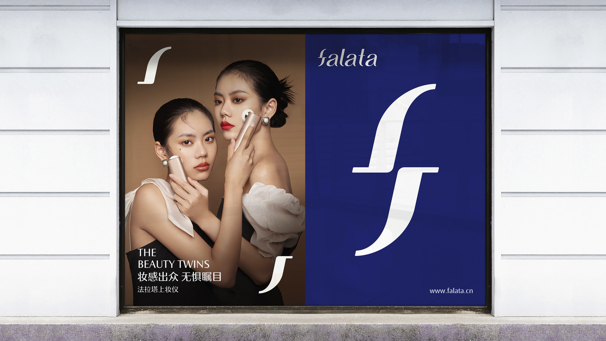
Falata is a brand that focuses on the relationship between products and beauty, a relationship that mirrors the connection between twins. The brand aims to establish a close bond with its users, and based on this, we have redefined Falata's brand philosophy as "Perfect Duality" to help reshape its brand spirit.
This relationship is reflected in their slogan, brand development, product research, and other aspects. Therefore, in our design, we focused on emphasizing this duality.
Awards
A' Design Award (Italy) - Runner up
Selected for Creative Presentation 9 Yearbook

Based on the characteristics of the handwritten letter "f", we designed a letter "f" that can be rotated and completely overlapped, which is also based on the font and creates a feeling that echoes the brand definition of "the most beautiful twin".
The interconnected "f" shapes nest and encircle each other, forming a natural and comfortable four-dimensional continuous graphic. You won't notice any conflicting connections between them; their calculated positions and distances are just right.


Add
B5-535, Fantasia Fortune Plaza No.3 Shihua Road,
Futian bonded area, Futian Dist., Shenzhen
Business
info@
© 2020-2024 Z WAVE DESIGN. All rights reserved.