


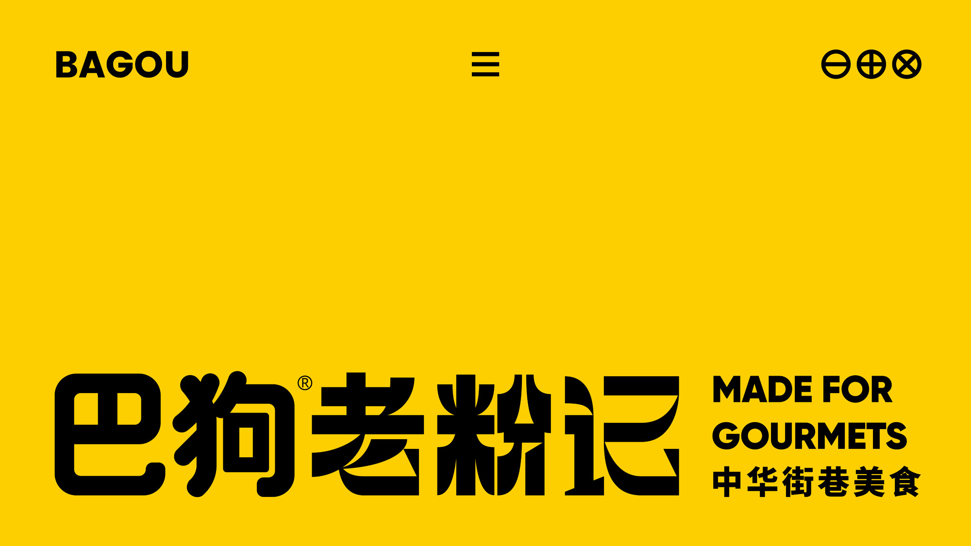
Ba Gou Lao Fen Ji
Brand Strategy
Logo Design
VI Design
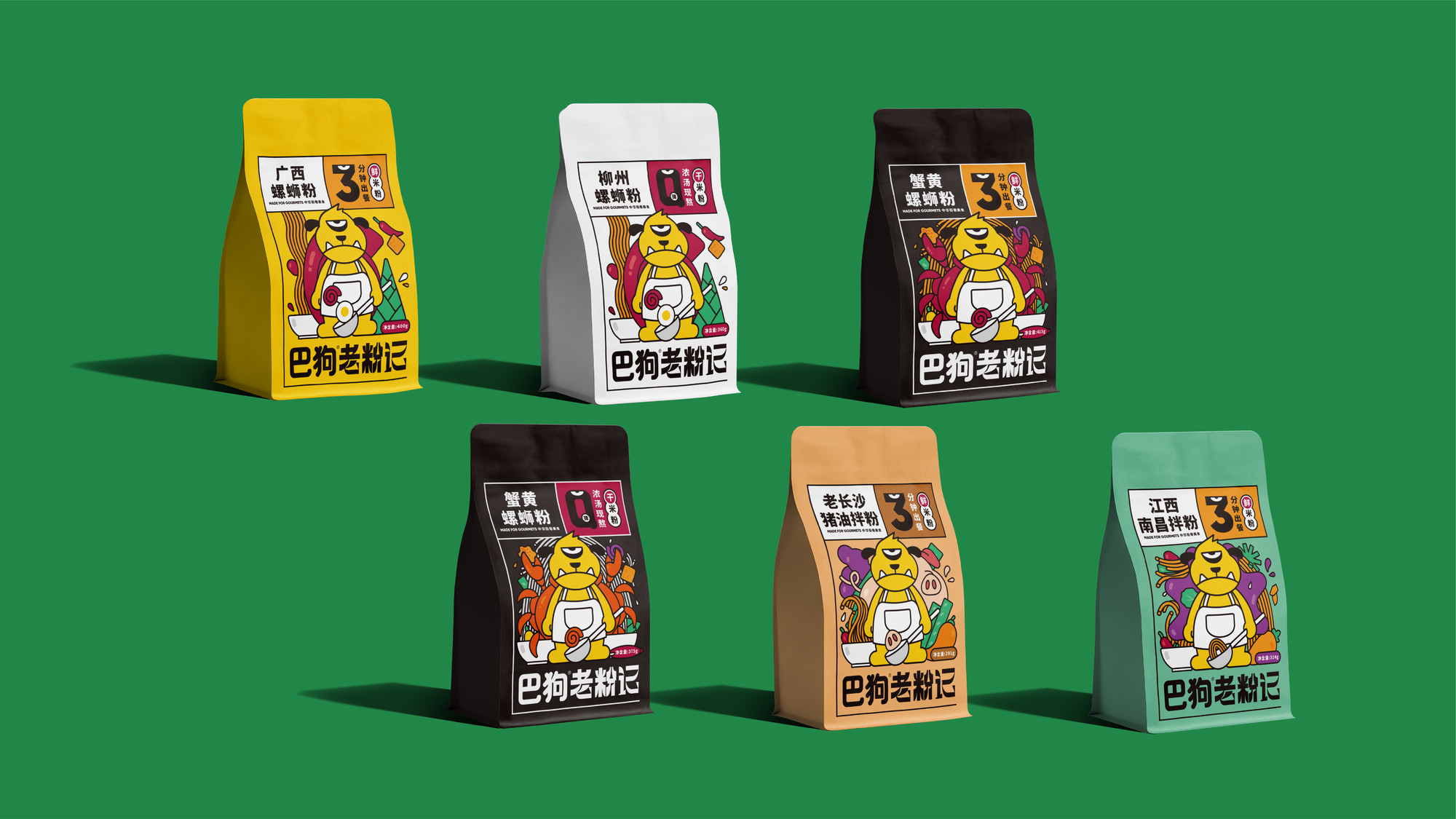
Systematic Packaging Design
Bagou is a popular instant noodle brand that specializes in noodle and rice-based fast food. Over the past few years, it has built a solid brand foundation with a unique, youthful, and fashionable image. As the brand's influence continues to grow, it has successfully proven its brand value. To further elevate the brand, we redefined its positioning as "Bagou Lao Fen Ji" (Ba Gou Old Noodle Legacy), focusing on authentic, urban, old-school flavors. This repositioning aids in upgrading the Ba Gou brand and rebranding its visual identity system.
Systematic Packaging Design
The packaging design for Bagou is inspired by the brand's need for overall visual cohesiveness and the deep exploration of grid systems. Based on these principles, we created a distinctive "Ba" character grid system specifically for Bagou. This grid system cleverly utilizes the character "Ba" to divide the packaging into areas for product name, information, selling points, and other functionalities. This approach not only meets the brand's requirements for a systematic packaging design but also showcases the unique identity of Bagou Lao Fen Ji through its grid pattern. Additionally, the use of the brand mascot and rich visual elements makes Bagou Lao Fen Ji's packaging stand out, creating a signature look that is unmistakably its own.This design approach ensures that Bagou's packaging aligns with the brand's revitalized identity, making it easily recognizable and appealing to the target audience.

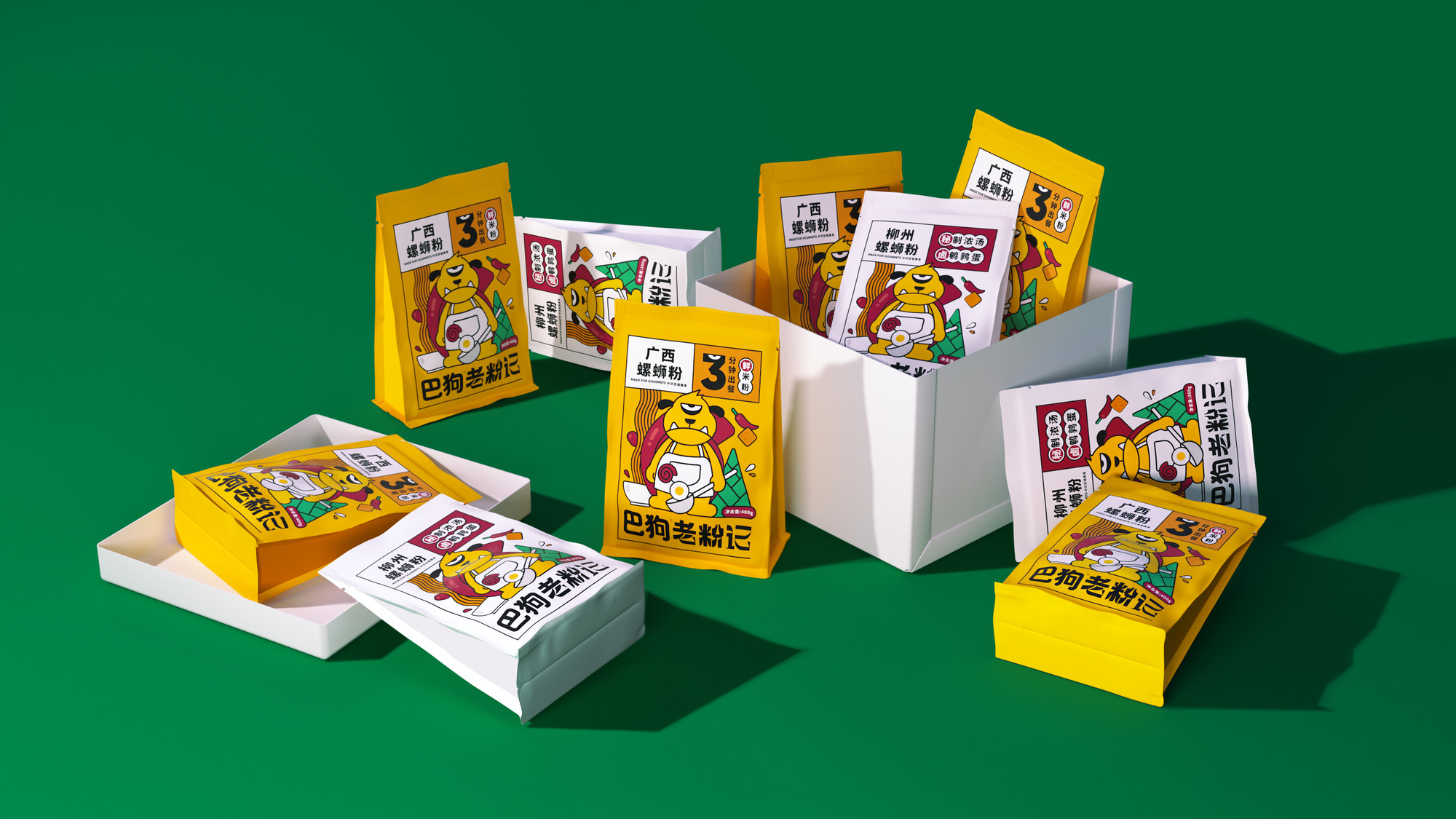
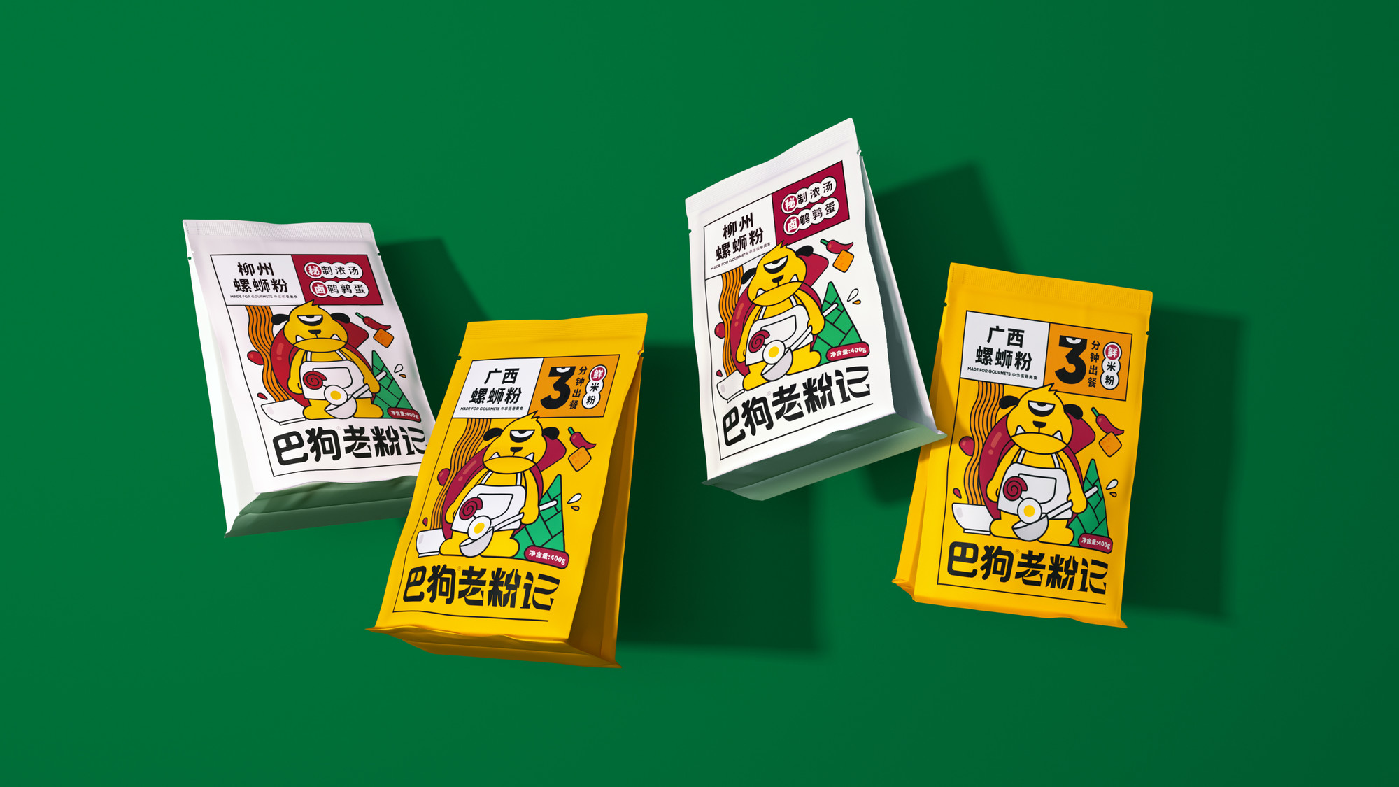


Currently, two products from Bagou, namely Lao Fen Ji (Fresh rice noodles) and Ganmifen (Dried rice noodles), have been launched. More new product lines will be gradually updated to form the Bagou brand visual system.


Address
B5-535, Fantasia Fortune Plaza
No.3 Shihua Road,
Futian bonded area, Futian Dist., Shenzhen
© 2020-2026 Z WAVE DESIGN. All rights reserved.