

7MAGPIE
Brand Strategy
Slogan
Logo Design
VI Design
CMF Design
Industrial Design
Packaging Design
Art Direction
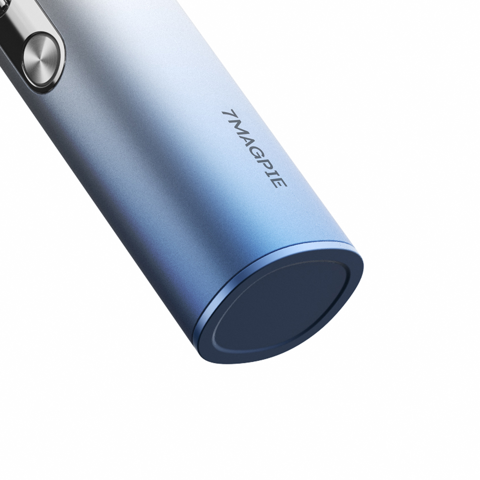
7MAGPIE is a portable fan brand incubated by an innovative Japanese team. With product strength and terminal layout capabilities as its core competencies, the brand has garnered a large following across the Asia-Pacific region. We joined forces to develop its new brand identity, establishing a comprehensive brand positioning strategy, visual identity system, packaging application system, and product appearance design—thus ushering in a new chapter for the brand in the global market.
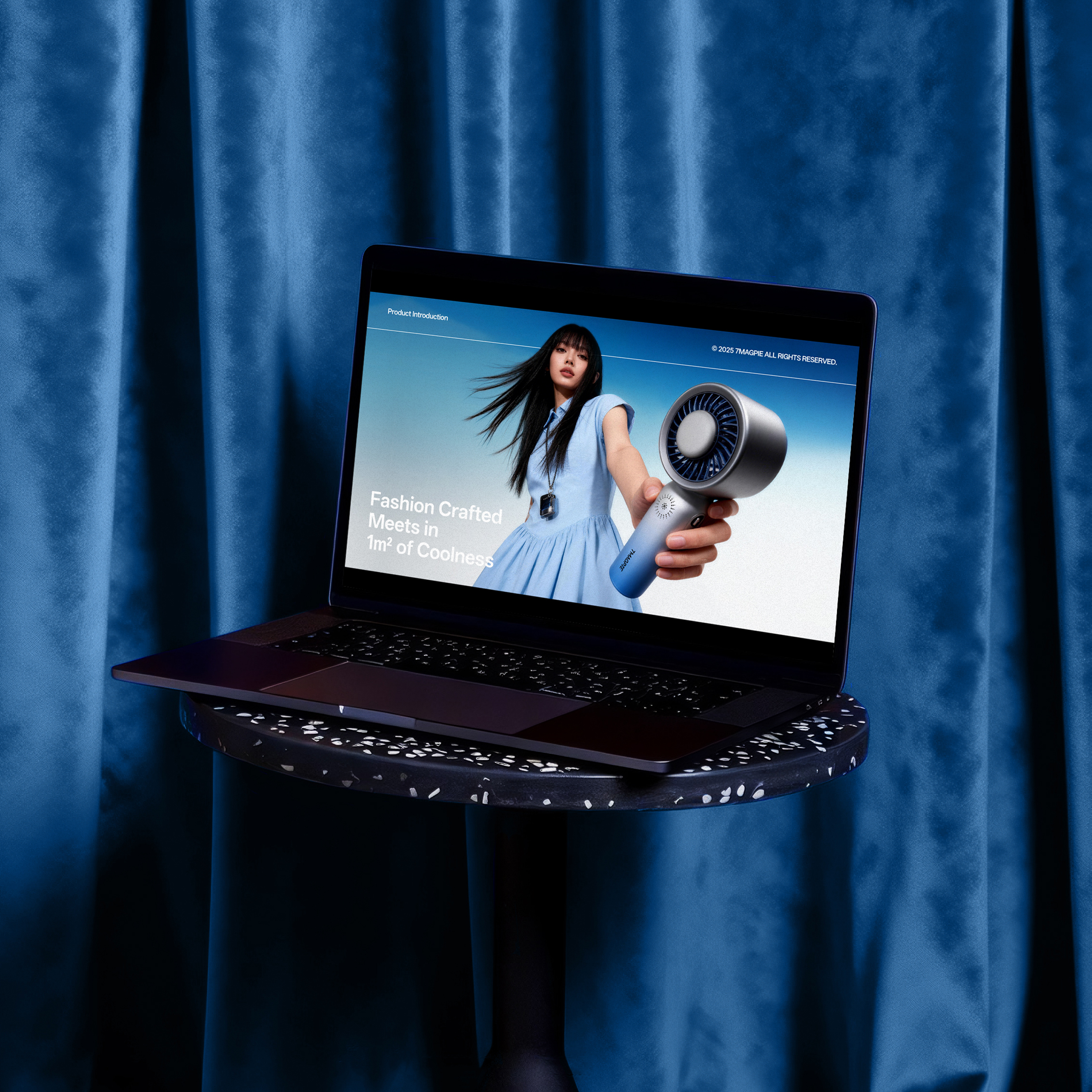
Guided by the brand strategy and geographical positioning, and tailored to its positioning as a provider of portable fans and a lifestyle experience, we proposed the brand concept of “Fashion Crafted Meets in 1㎡ of Coolness”. This concept delivers innovative solutions for 7MAGPIE that are closely aligned with market trends and user needs. Through strategic brand positioning and design, we created a clear and coherent brand expression for 7MAGPIE, defining its distinctive stylistic direction.
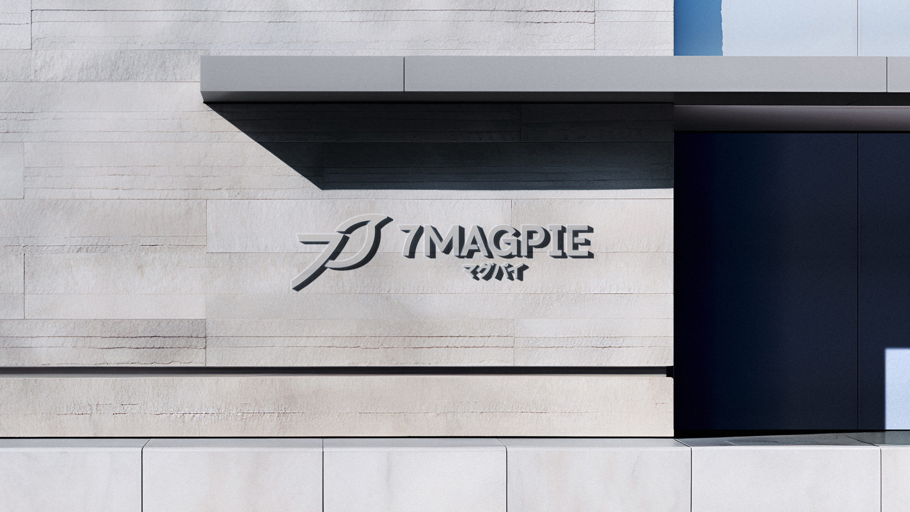
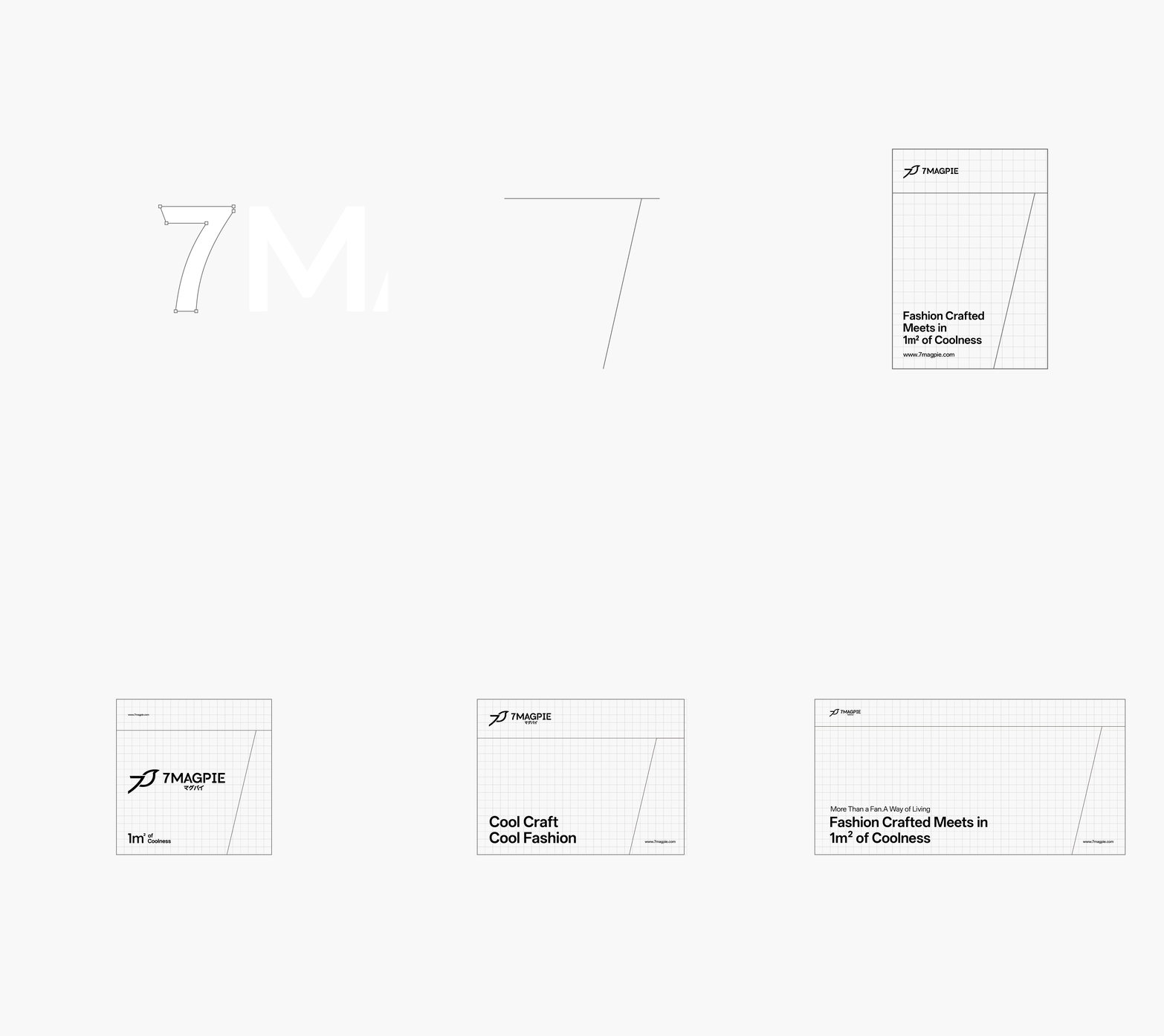
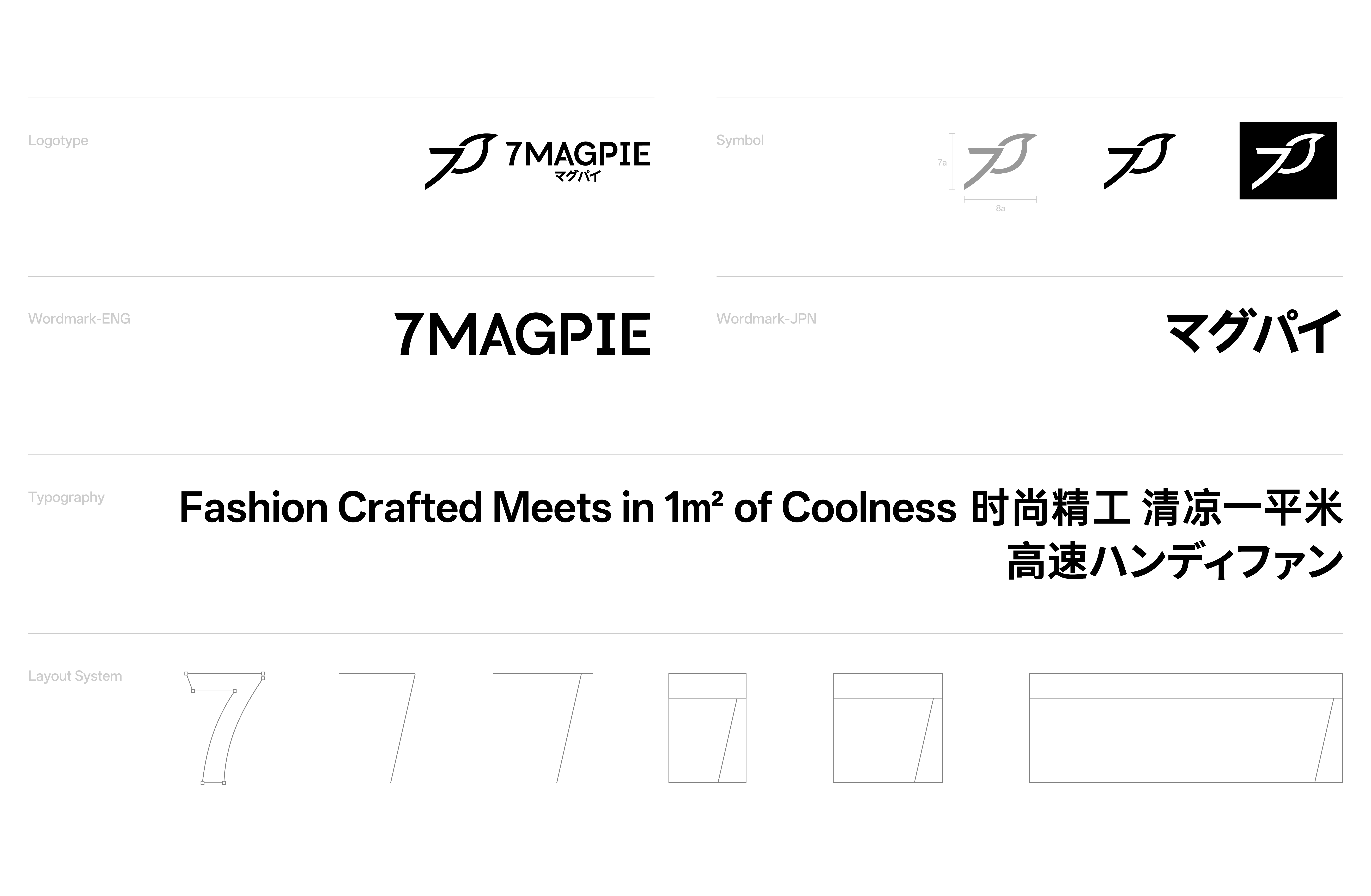
The logo design is refined from the brand’s visual hammer. Drawing inspiration from the brand name, we extracted its core naming characteristics—the fusion of the number “7” and the “MAGPIE” motif. Leveraging the global universal recognition of both the number “7” and “MAGPIE”, we crafted an exclusive brand form that minimizes communication losses across diverse cultural contexts, ensuring visual clarity and recognizability in the global market. The brand application guidelines are developed based on three core principles: systematization, distinctiveness, and usability. With “7” as the central element, we implemented spatial division on the visual plane through minimalist geometric shapes and lines. Rigorous grids and structured divisions reinforce the brand’s dual strategic pillars—“Fashion Crafted” and “1㎡ of Coolness”—while unifying the visual DNA, marketing touch points, and packaging system. This forms a set of visual language that balances consistency and flexibility, perfectly embodying the brand spirit of 7MAGPIE.
Award
IDEA International Design Excellence Award



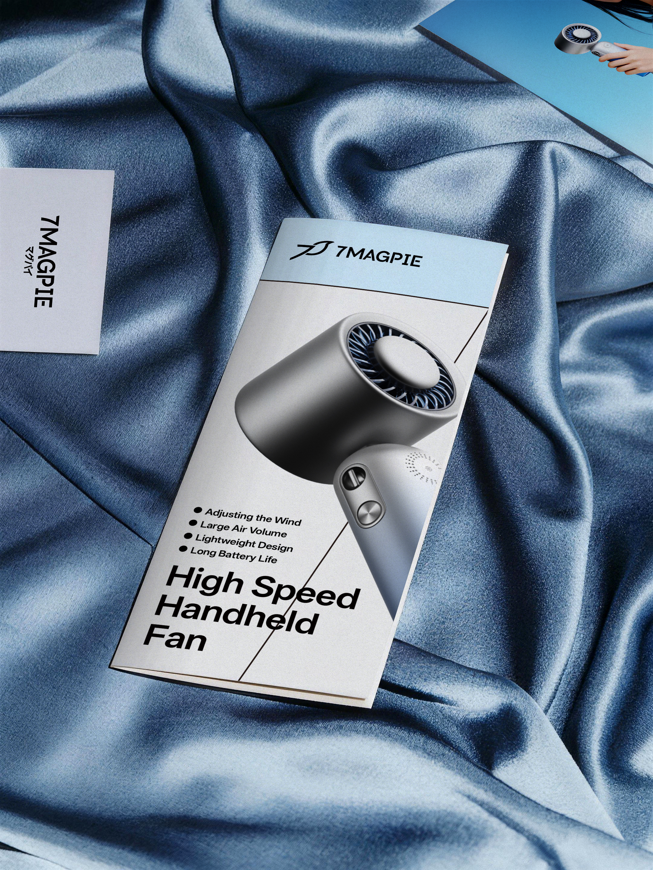
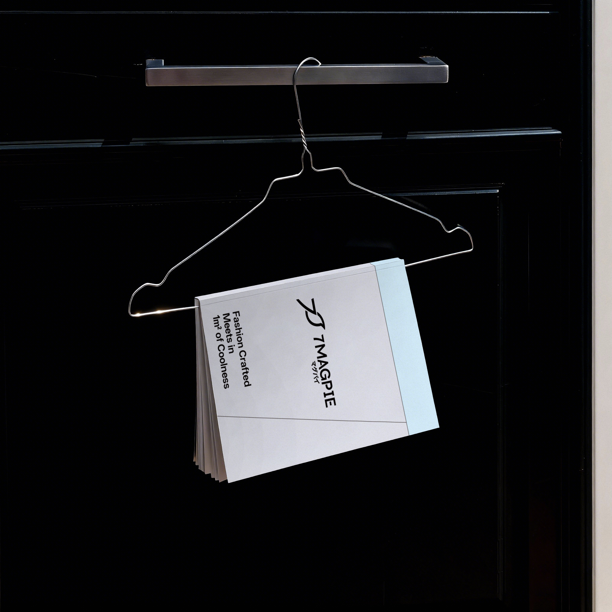

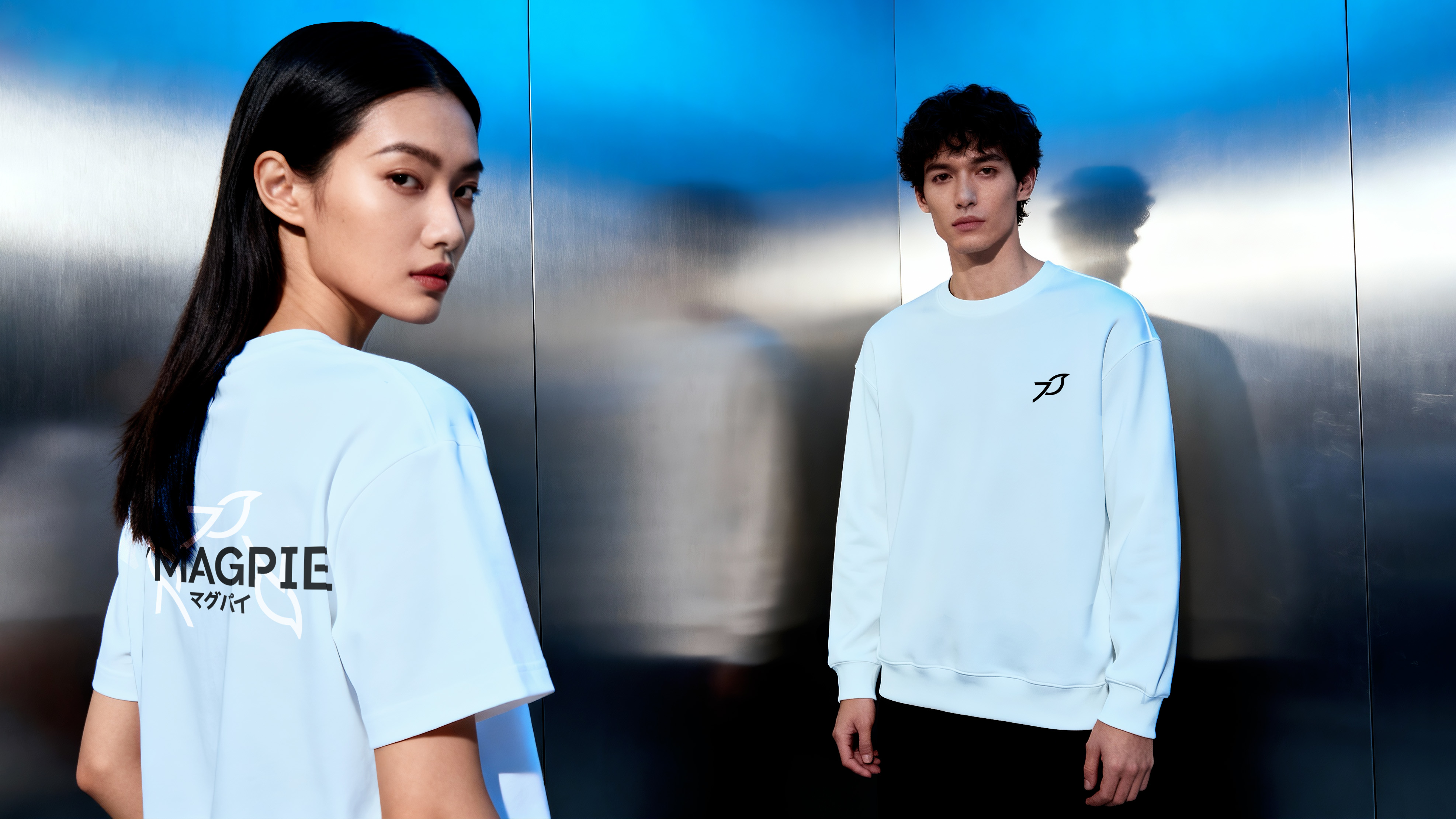
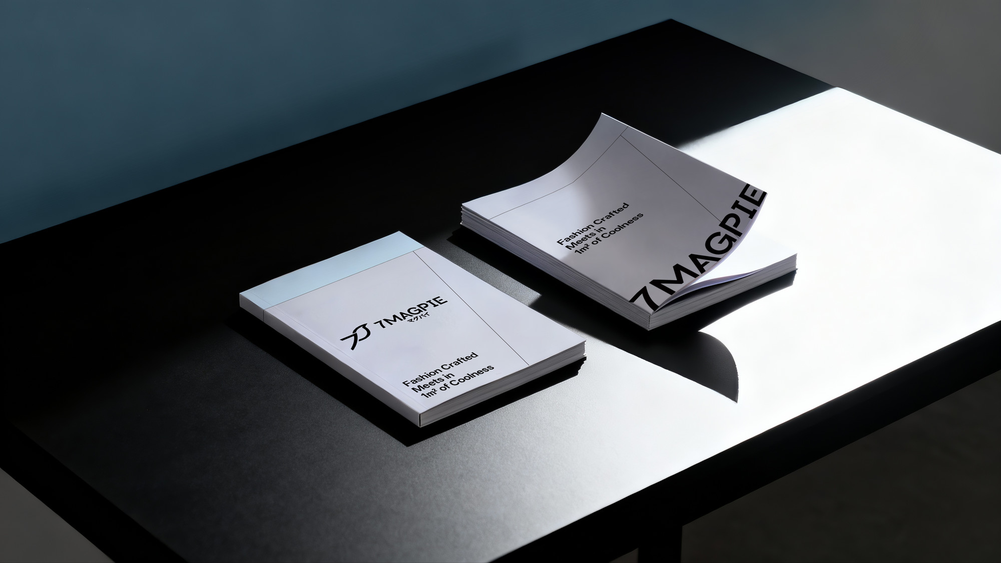
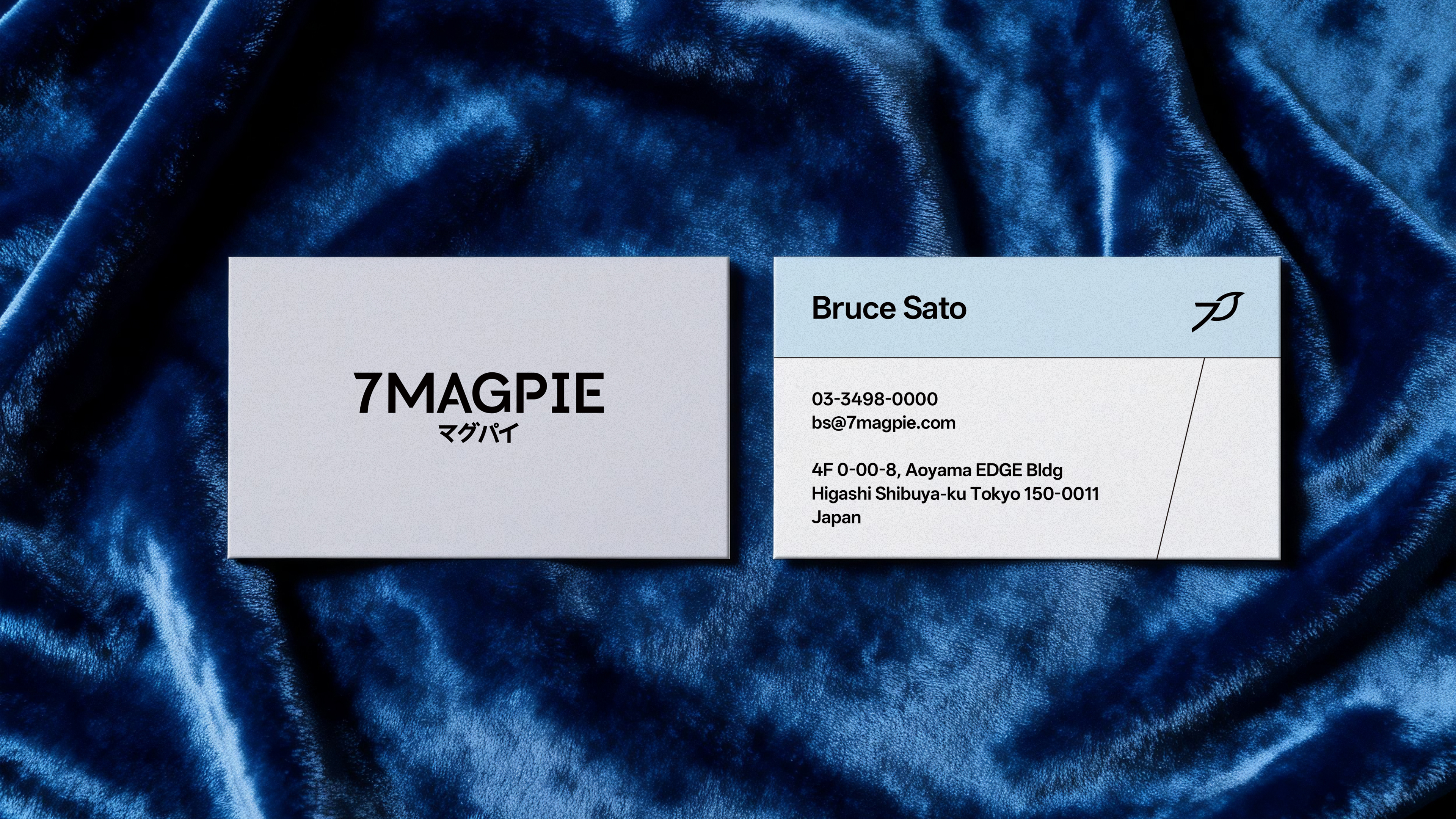
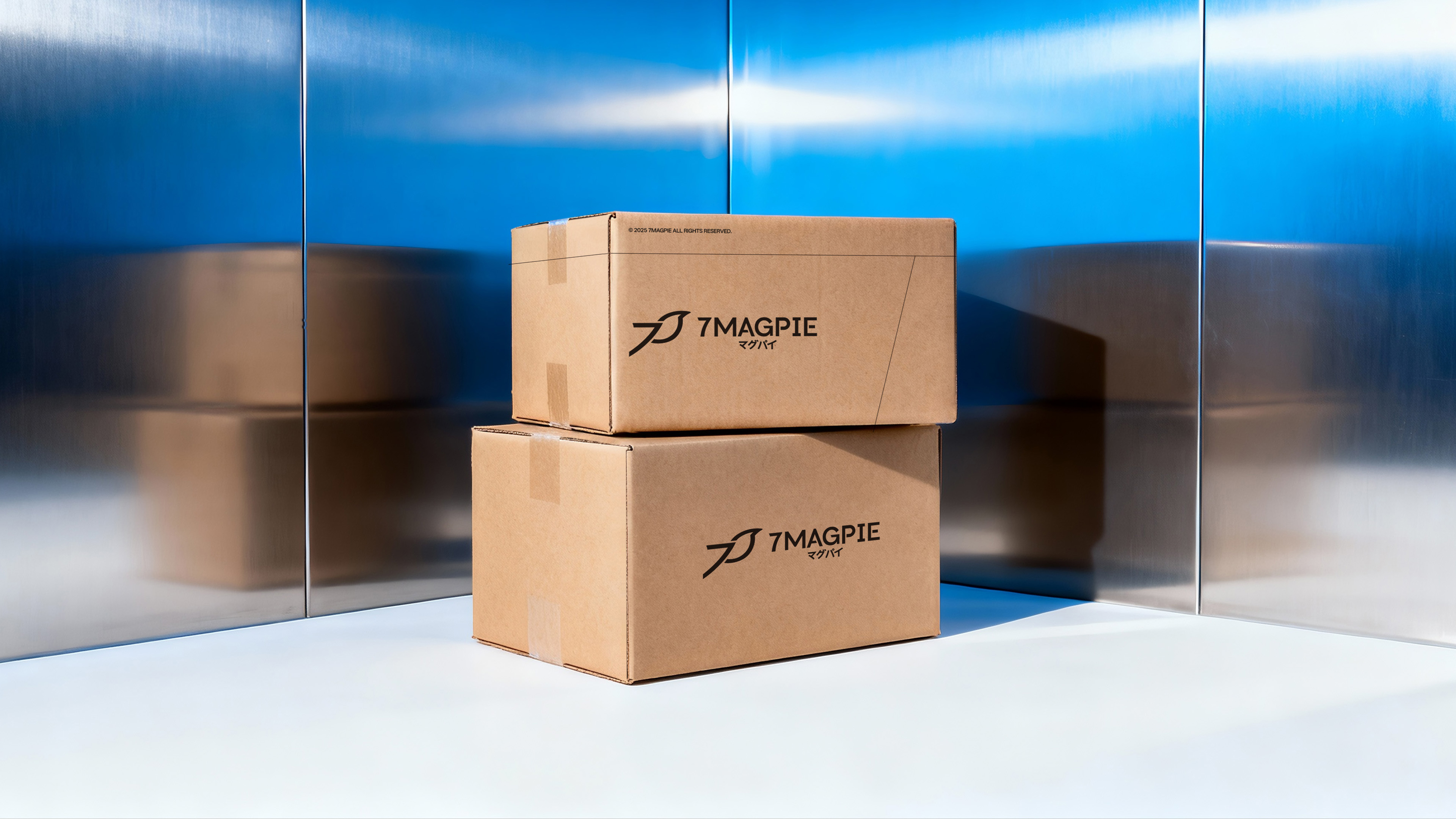
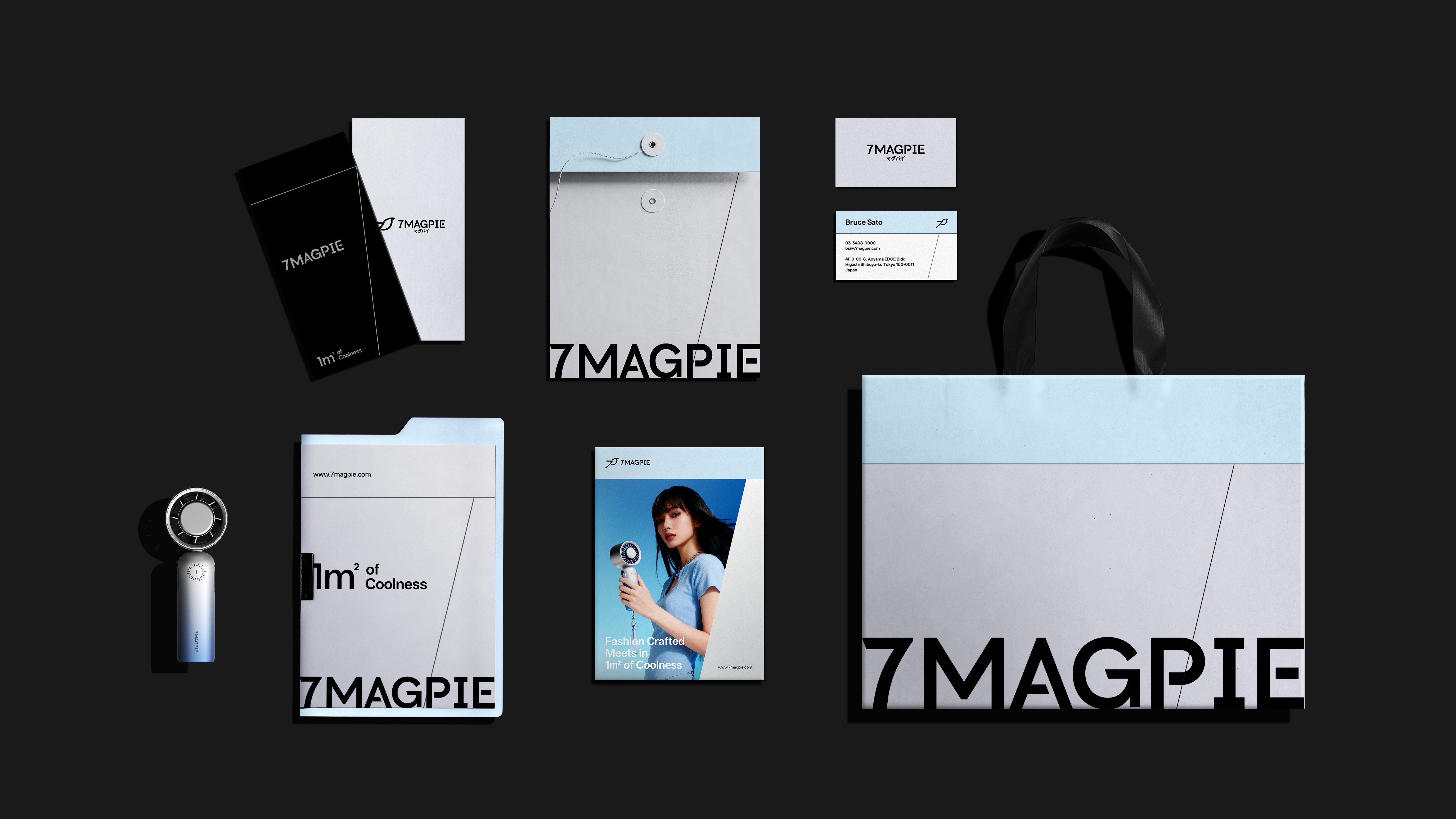
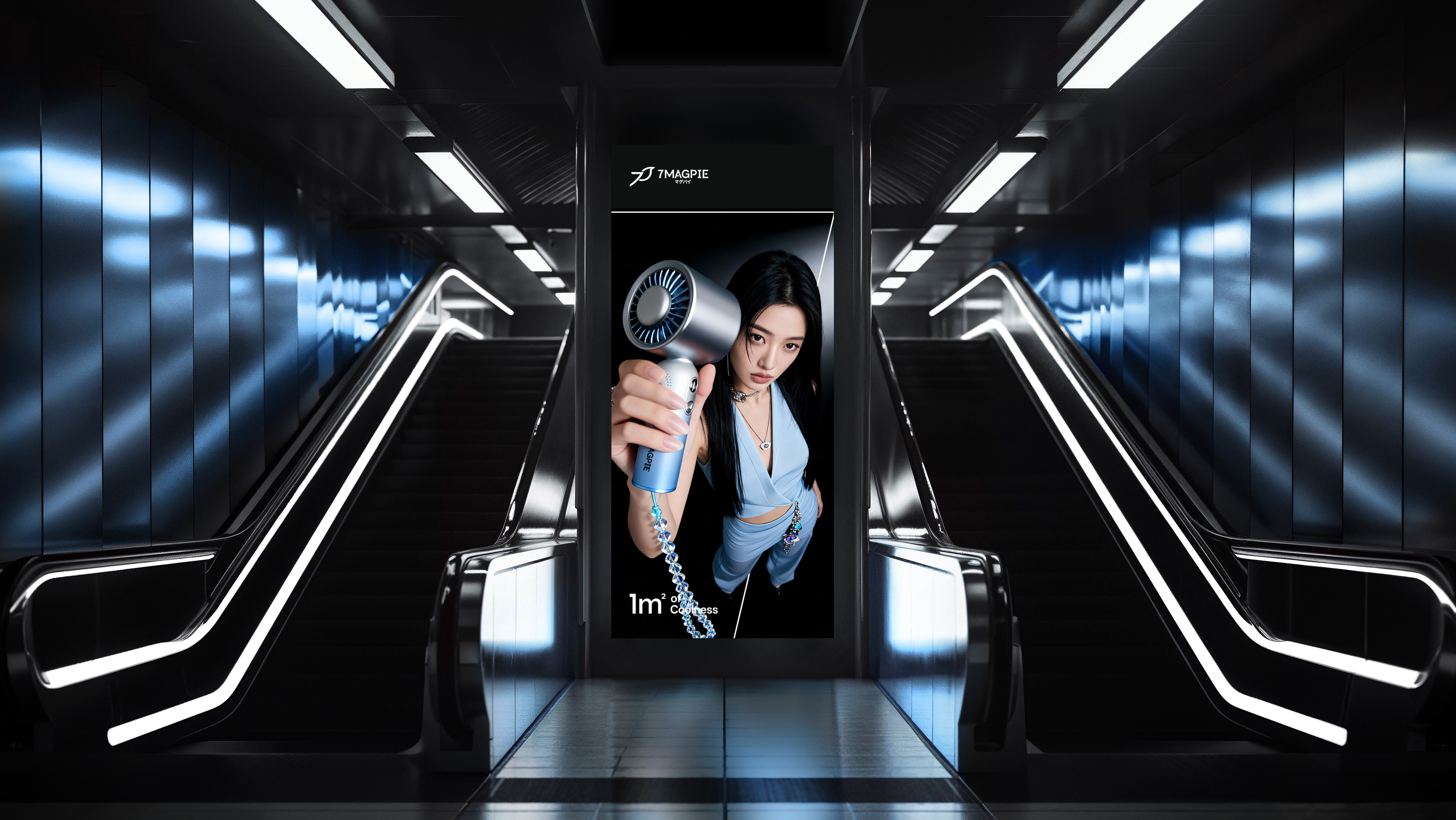
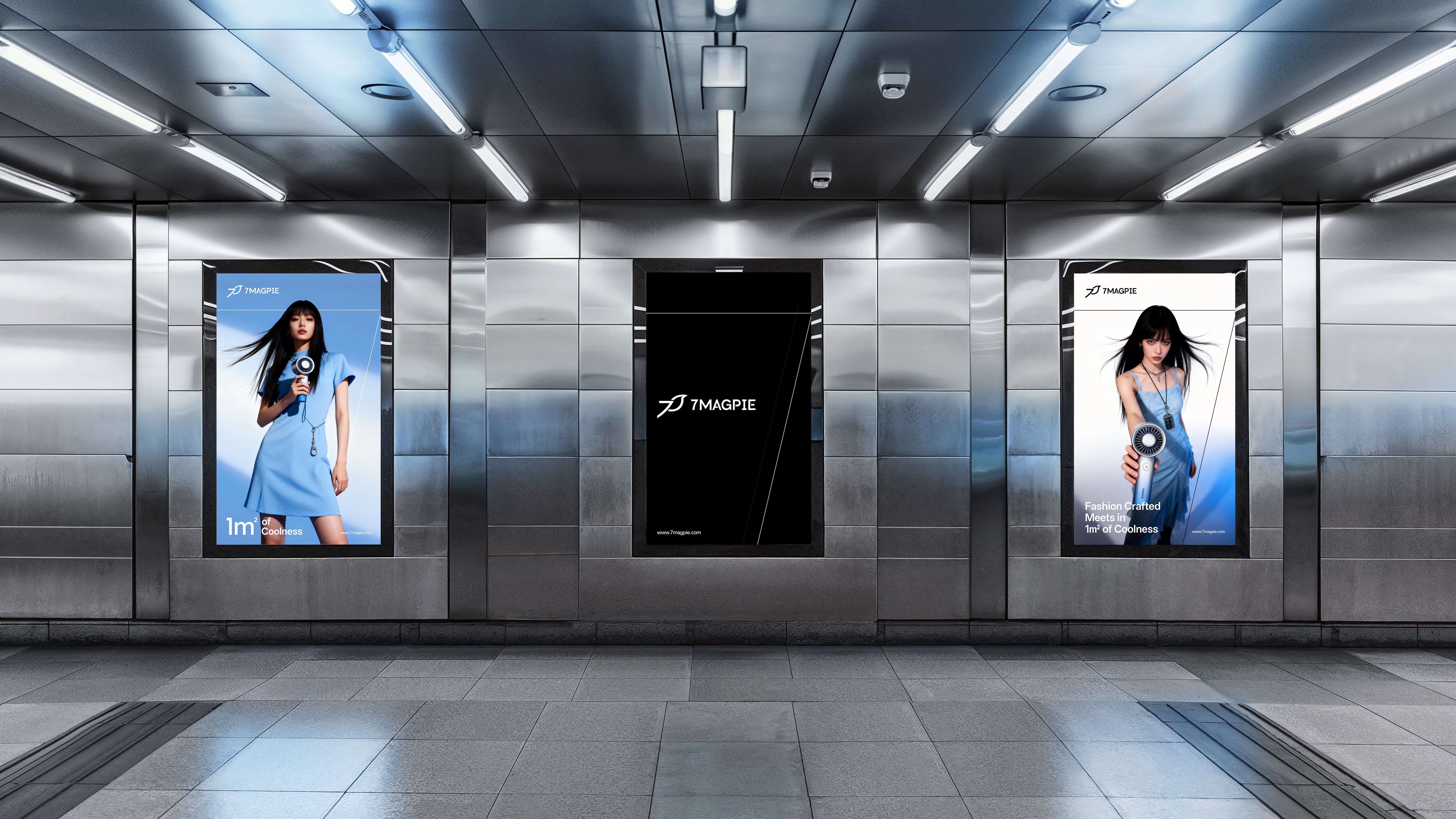
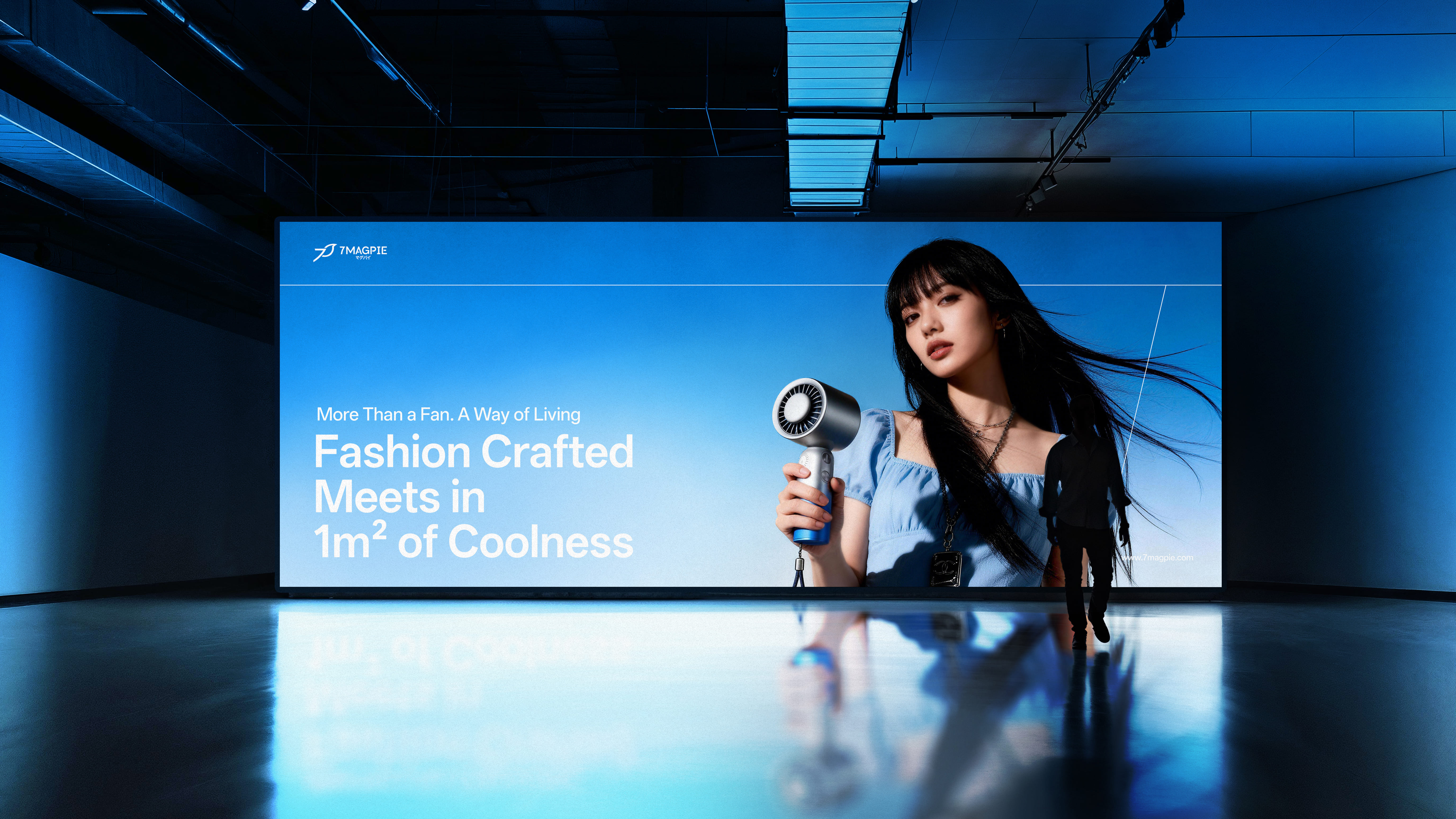
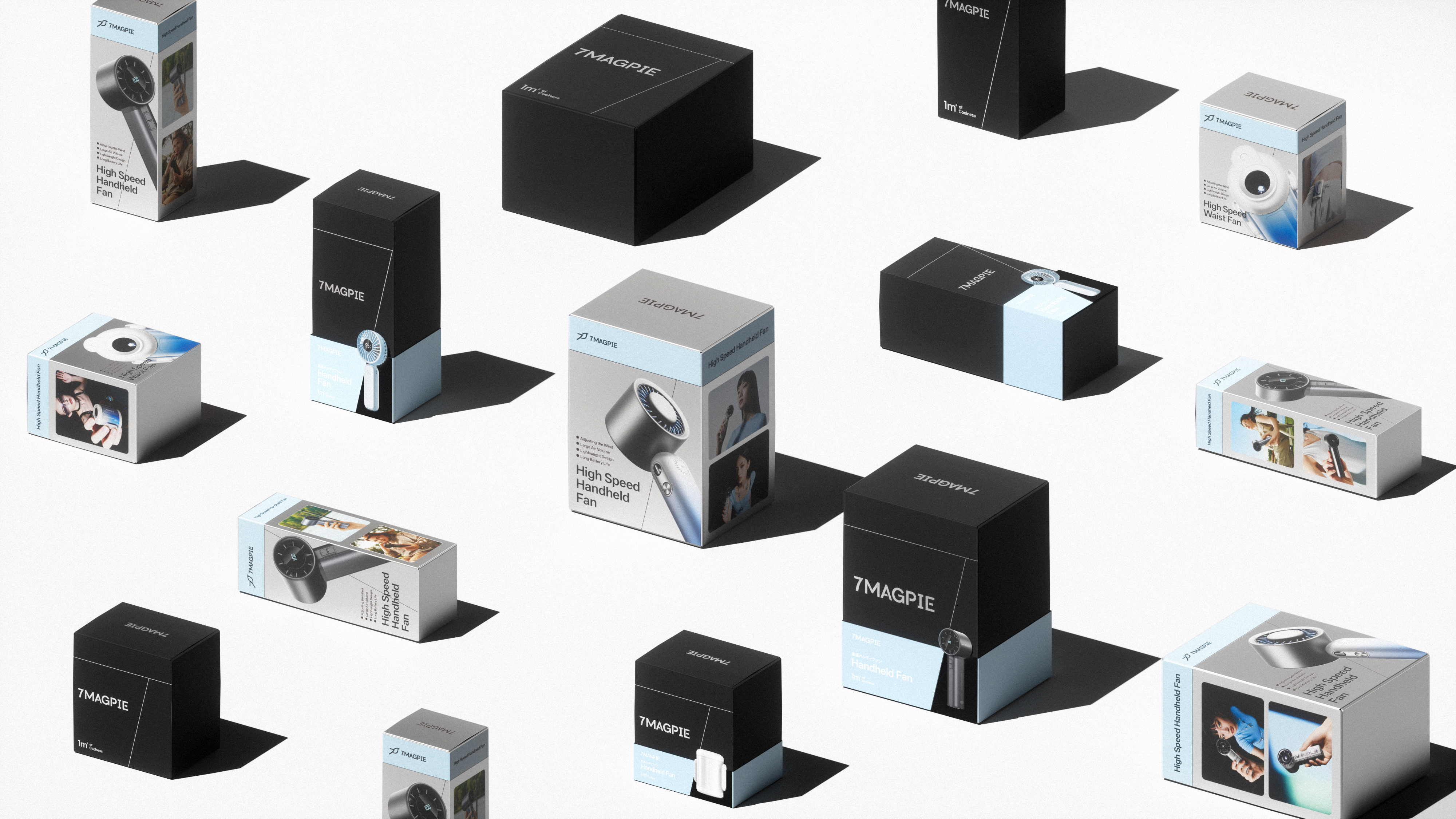
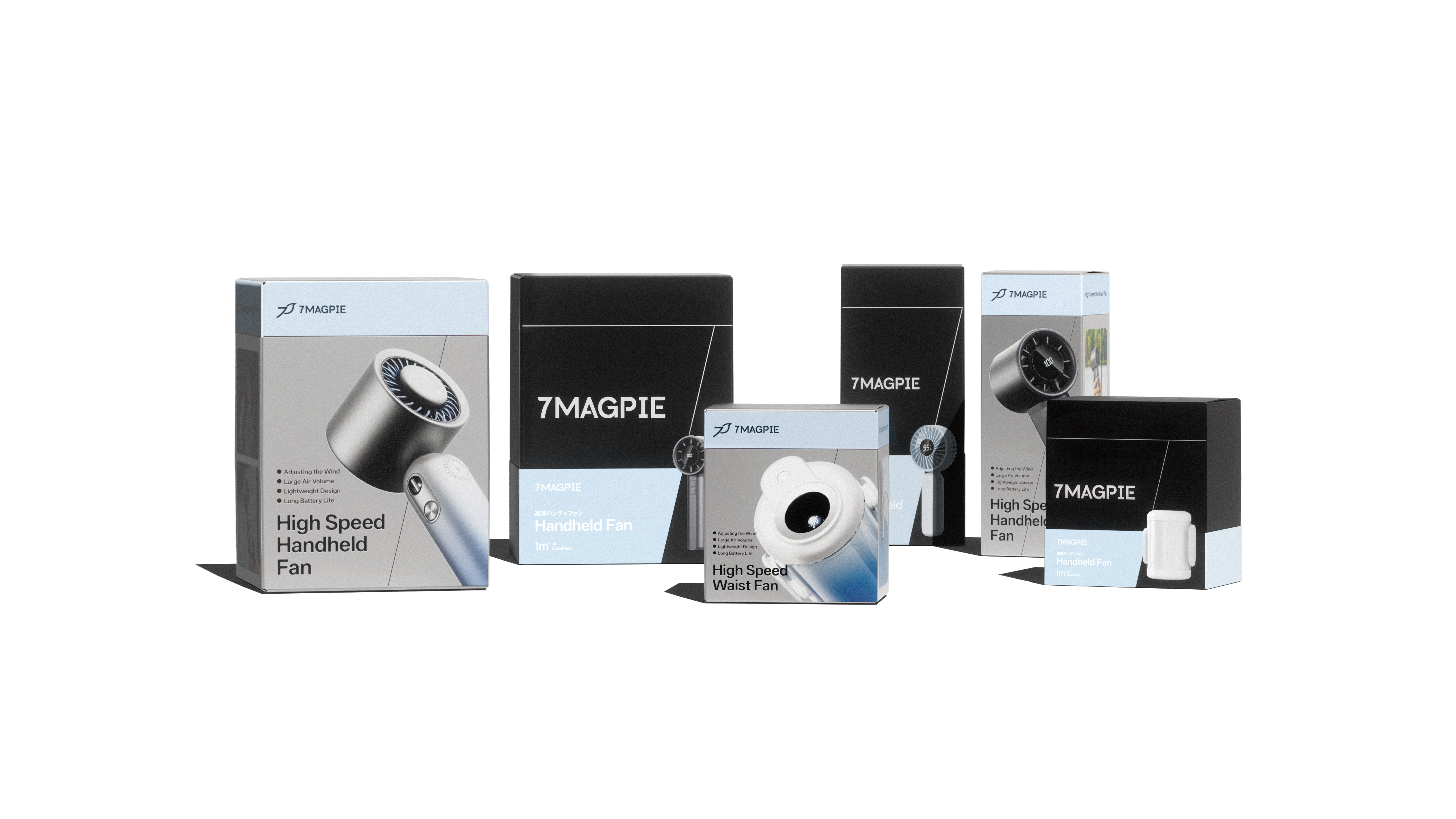
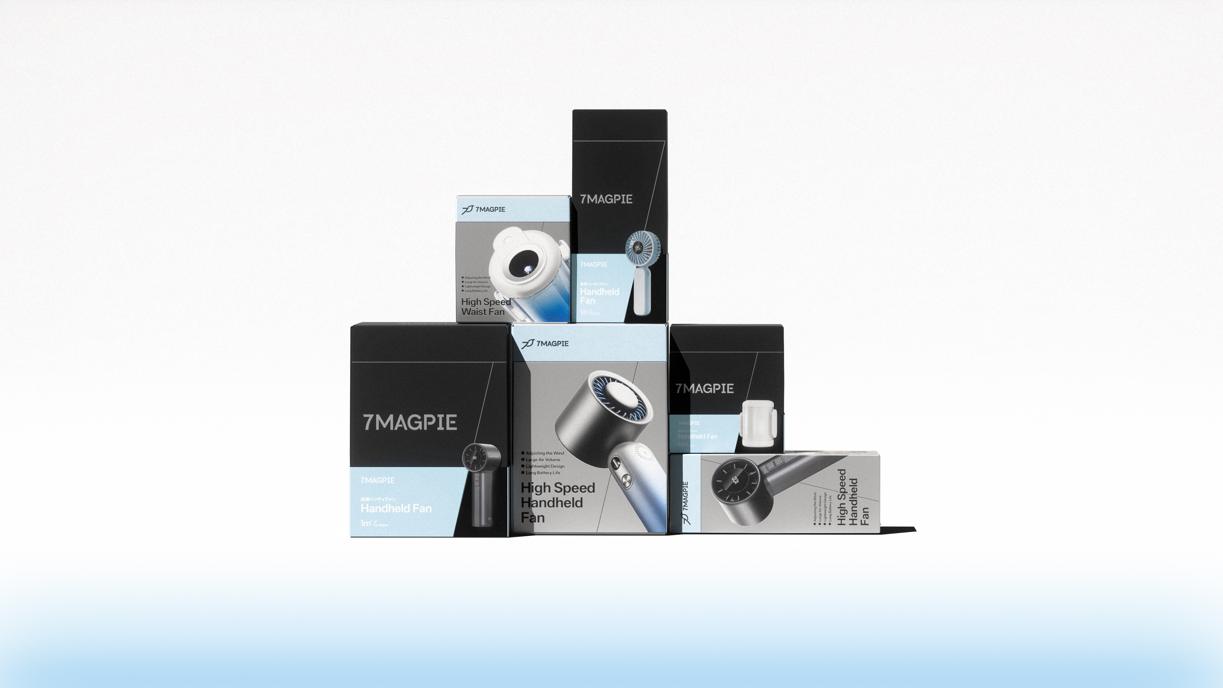
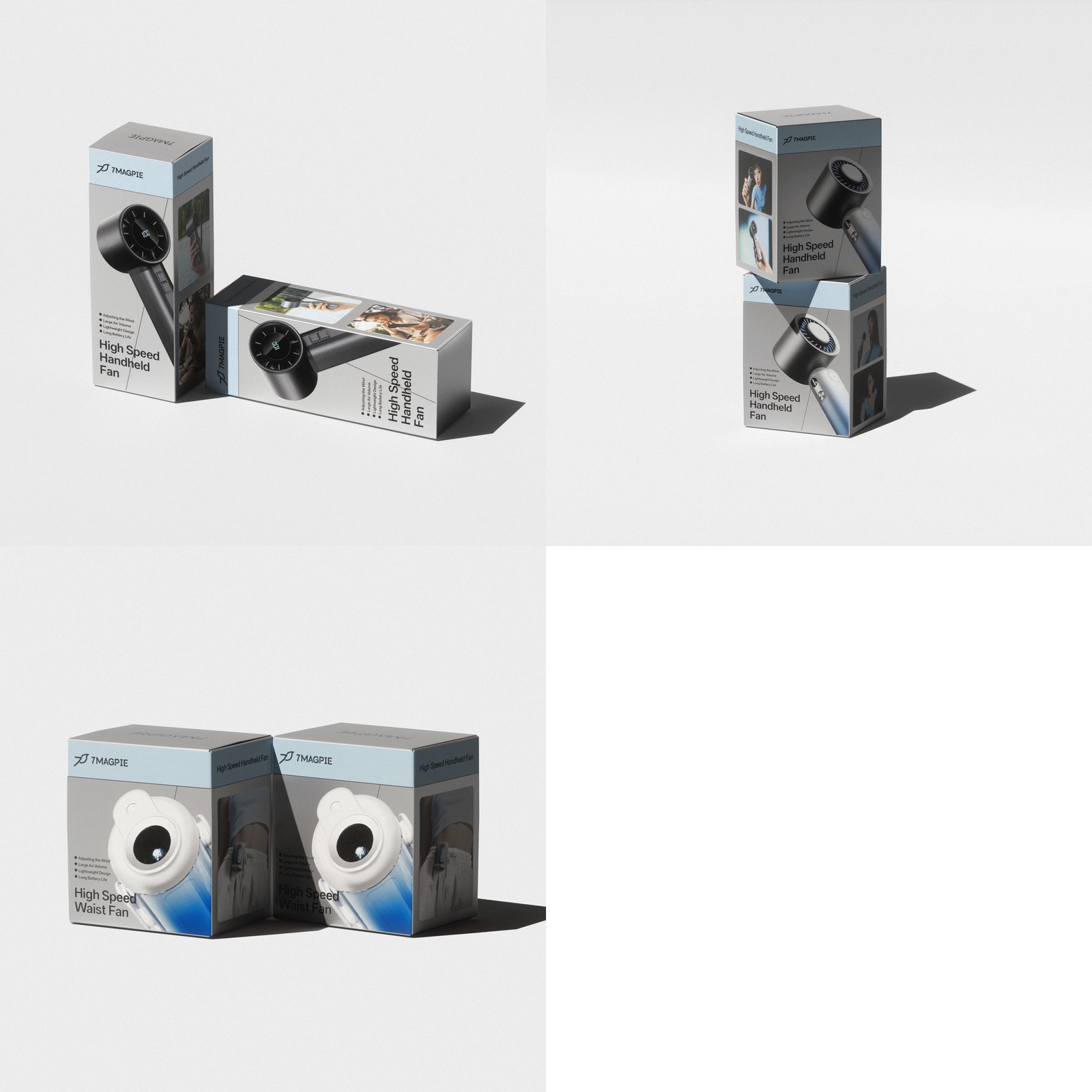
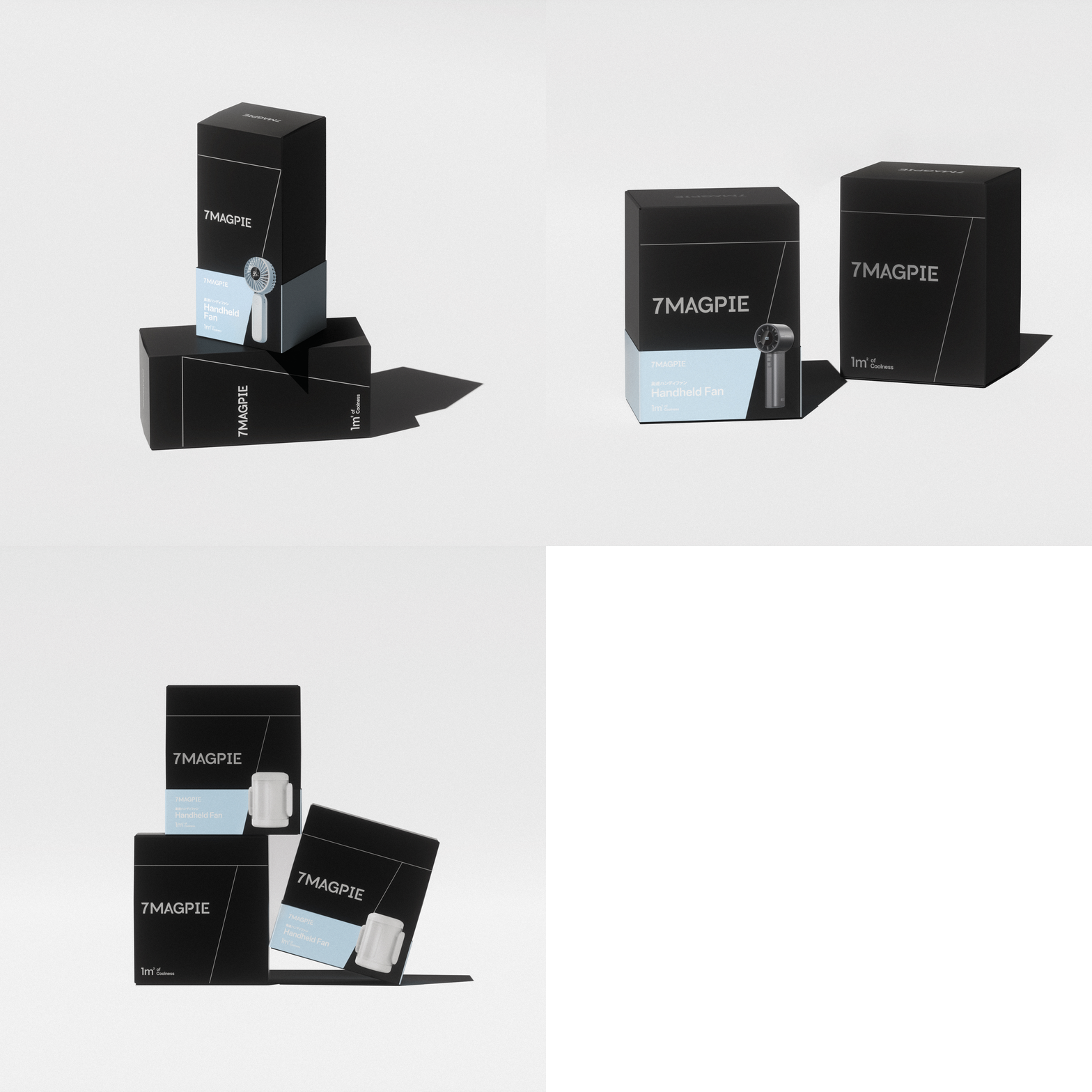
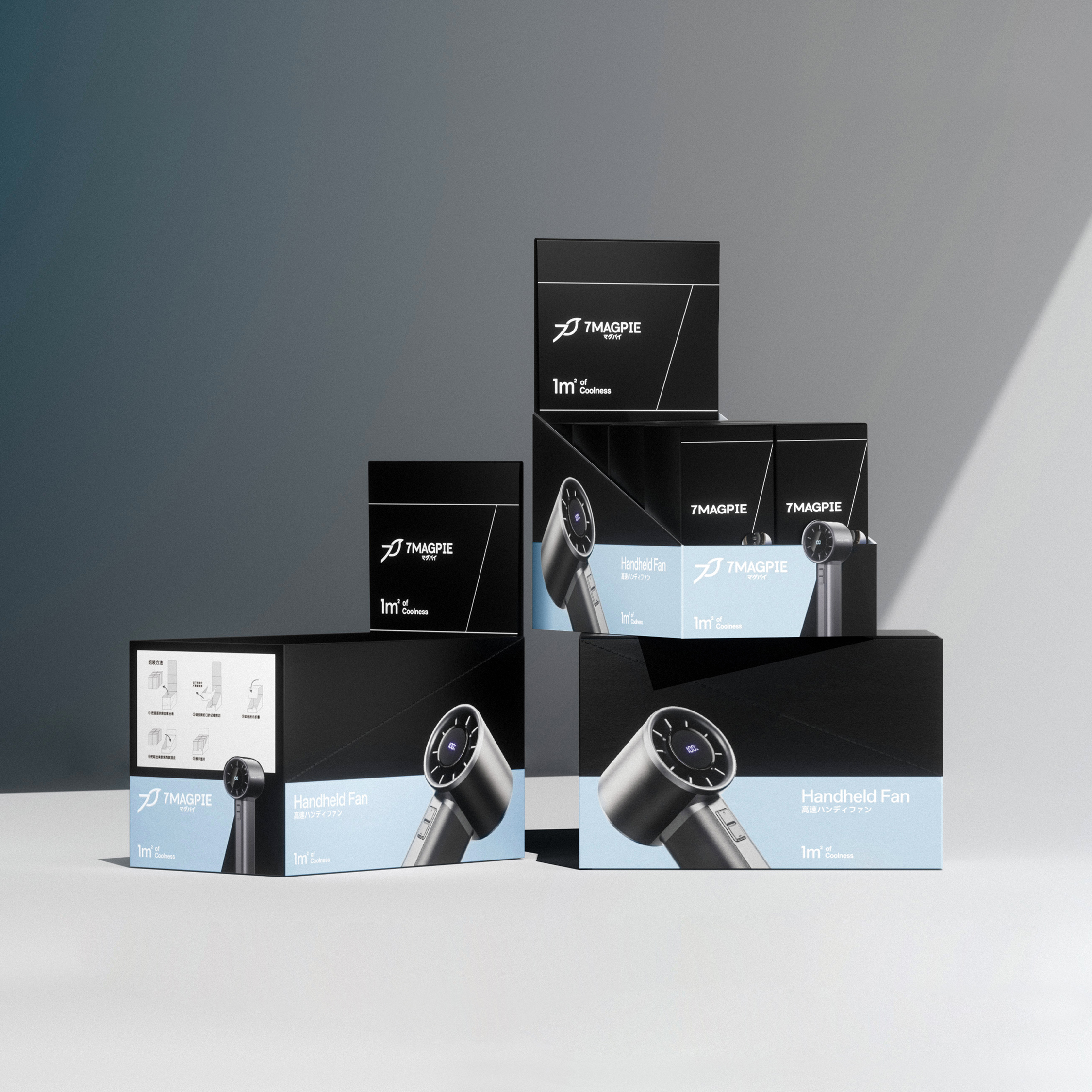
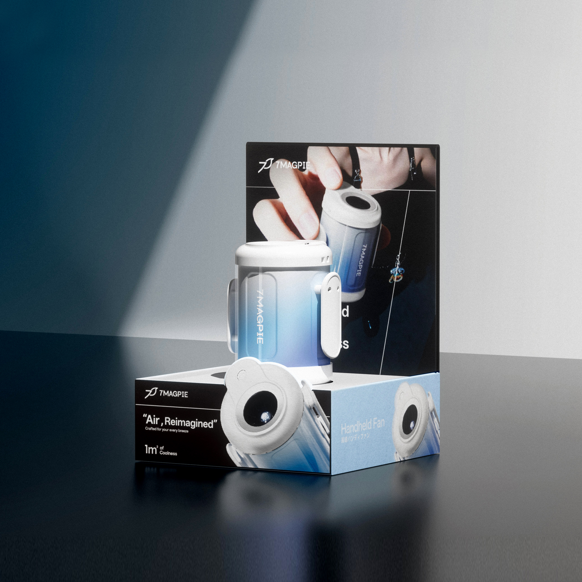
For packaging design, building on the systematic visual framework, we established two parallel packaging systems—“Standard Packaging” and “Gift Box Packaging”—distinguished by color coding. We streamlined the information hierarchy to enhance information accessibility, creating standardized layout and display formats for all 7MAGPIE products. These designs strike a balance between clarity and adaptability to both online and offline sales environments, while reinforcing the brand’s core DNA of minimalism and technological sophistication.


Address
B5-535, Fantasia Fortune Plaza
No.3 Shihua Road,
Futian bonded area, Futian Dist., Shenzhen
© 2020-2026 Z WAVE DESIGN. All rights reserved.